Share of renewable energy production in the world
First, let’s produce a graph with the countries with the highest and lowest % contribution of renewables in energy production.
#Energy Dataset converted to wide format and calculated % of renewable energy (rounded 3 decimal places)
energy_renew <- energy %>%
  filter(year==2019)  %>%
  select(c(variable,value,country)) %>%
  pivot_wider(names_from = variable, values_from = value) %>%
  mutate(perc_hydro=round(elec_hydro/elecprod, 3),
         perc_solar=round(elec_solar/elecprod, 3),
         perc_wind=round(elec_wind/elecprod, 3),
         perc_renew_other=round(elec_renew_other/elecprod, 3),
         perc_renew=round(perc_hydro+perc_solar+perc_wind+perc_renew_other,3)) %>%
  mutate(country=fct_reorder(country,perc_renew))

#Filtered data set for non-negative percentage and chose the bottom 20 countries followed by the graph formatting
energy_min_20 <- energy_renew %>%
  filter(perc_renew>0) %>%
  group_by(country) %>%
  summarise(perc_renew=sum(perc_renew)) %>%
  slice_min(perc_renew,n=20) %>%
  mutate(country=fct_reorder(country,perc_renew)) %>%
  ggplot(aes(perc_renew,country))+
  geom_col()+
  scale_x_continuous(labels=scales::percent)+
  labs(x=NULL,y=NULL)+
  theme_minimal() +
  theme(text = element_text(size = 7))

#Filtered data set for non-negative percentage and chose the top 20 countries followed by the graph formatting
energy_max_20 <- energy_renew %>%
  filter(perc_renew>0) %>%
  group_by(country) %>%
  summarise(perc_renew=sum(perc_renew)) %>%
  slice_max(perc_renew,n=20) %>%
  mutate(country=fct_reorder(country,perc_renew)) %>%
  ggplot(aes(perc_renew,country))+
  geom_col()+
  scale_x_continuous(labels=scales::percent)+
  labs(x=NULL,y=NULL)+
  theme_minimal()+
  theme(text = element_text(size = 7))

#Graphs are combined and labelled
energy_max_20 + energy_min_20 +
  plot_annotation(title = "Highest and lowest % of renewables in energy production",
                  subtitle = "2019 Data",
                  caption = "Source: NBER CHAT Database")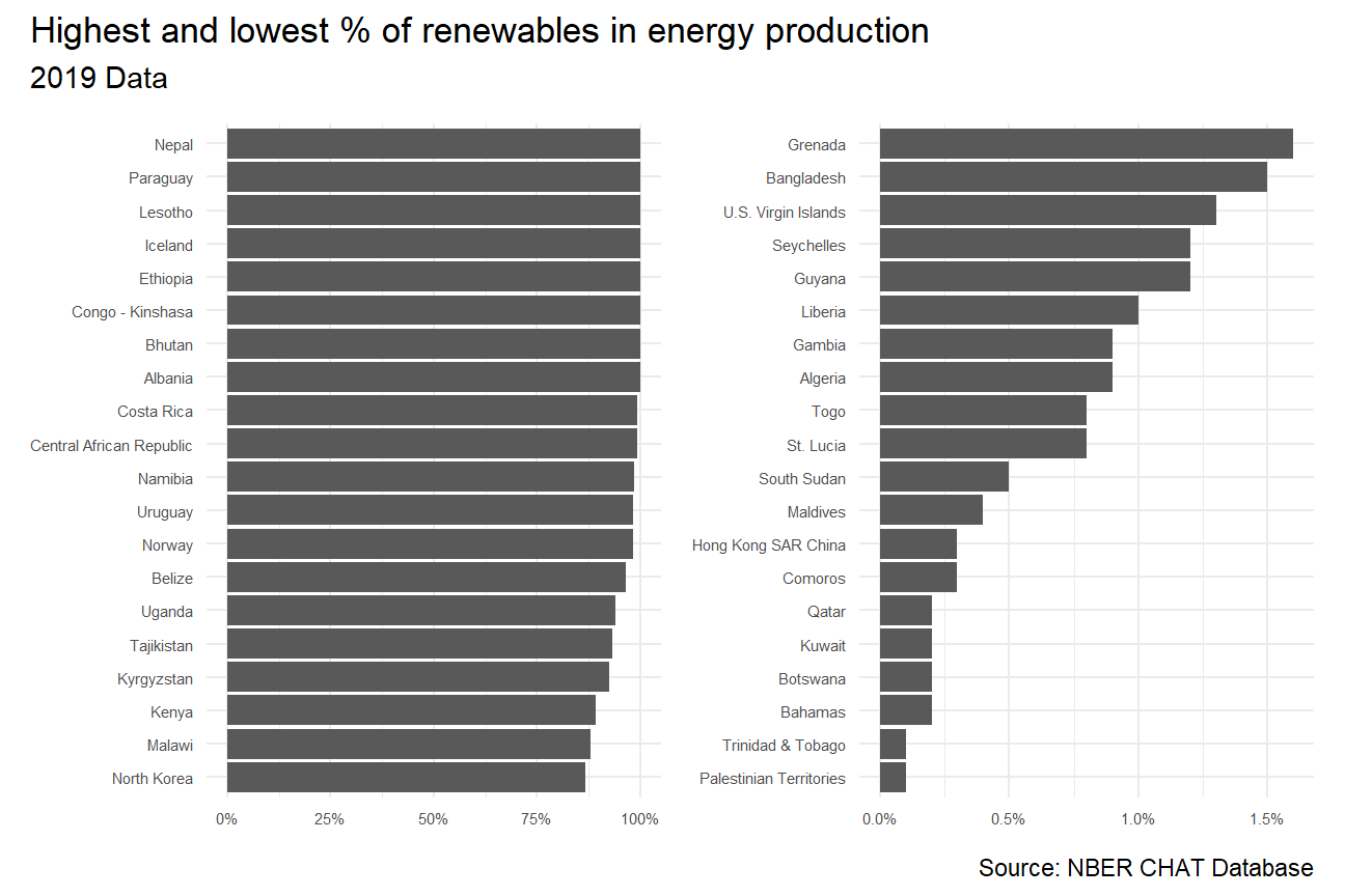
Second, we can produce an animation to explore the relationship between CO2 per capita emissions and the deployment of renewables.
#Create a pivot wider format and add new column
energy_perc <- energy %>%
  select(year, variable,value,country) %>%
  pivot_wider(names_from = variable, values_from = value) %>%
  mutate(percent_renew = (elec_hydro+elec_solar+elec_wind+elec_renew_other)/elecprod *100)

# Select only interested columns in energy chart
energy_perc_filtered <- energy_perc %>%
  select(year, country, percent_renew)

# Select only interested columns in co2 chart
co2_percap_filtered <- co2_percap %>%
  select(country, date, value, iso3c) %>%
  rename(year = date)

# Join the tables (energy, co2, and income_level)
energy_combined1 <- left_join(energy_perc_filtered, co2_percap_filtered, by = c("country", "year"))
energy_combined2 <- left_join(energy_combined1, countries, by = c("iso3c"))

# Create visualization (packages required)
energy_combined2 %>%
  mutate(year = as.integer(year)) %>%
  filter(year>=1990, !is.na(income_level)) %>%
  ggplot(aes(x=percent_renew, y=value, color = income_level))+
  geom_point()+
  theme_bw()+
  theme(legend.position="none")+
  facet_wrap(~income_level) +
  labs(title = 'Year: {frame_time}',
       x = '% renewables',
       y = 'CO2 per cap') +
  transition_time(year) +
  ease_aes('linear')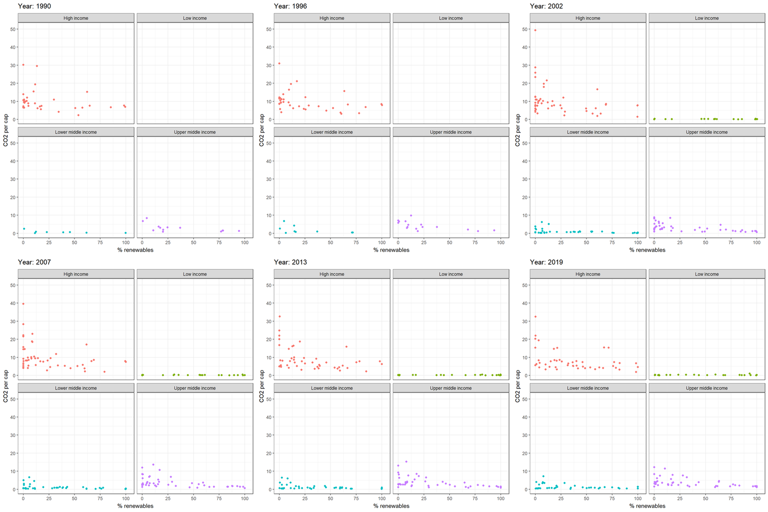
#Find out correlation
kable(correlate(energy_combined2$percent_renew,energy_combined2$value),
caption = "Correlation CO2 and renewables")| term | x |
|---|---|
| x | -0.333 |
Conclusion:
Since the correlation value for Co2 emission and usage renewable energy is negative, we can roughly say that as usage of renewable energy goes up, we can reduce CO2 emission by up to 33%. This finding would correspond to the common understanding on how renewable energy could be a vital factor in slowing down climate change.