BBC iPlayer streaming data

Introduction and BBC iPlayer streaming data
Cleaned Data
Let’s load the cleaned data and investigate what’s in the data. See below for column descriptions.
Before we proceed let’s consider the usage in January only.
User based data
We will try to create meaningful customer segments that describe users of the BBC iPlayer service. First we need to change the data to user based and generate a summary of their usage.
Data format
The data is presented to us in an event-based format (every row captures a viewing event). However we need to detect the differences between the general watching habits of users.
Feature Engineering
For the workshop let’s generate the following variables for each user.
- Total number of shows watched and ii. Total time spent watching shows on iPlayer by each user in the data
# count number shows per user
userData <- cleaned_BBC_Data %>%
            group_by(user_id) %>%
            summarise(noShows = n(),
total_Time = sum(time_viewed_min)) - Proportion of shows watched during the weekend for each user.
# let's find the number of shows on weekend and weekdays
userData2 <- cleaned_BBC_Data %>%
             group_by(user_id,
                      weekend) %>%
             summarise(noShows = n())

# let's find percentage in weekend and weekday
userData3 = userData2 %>%
            group_by(user_id) %>%
            mutate(weight_pct = noShows / sum(noShows))

# let's create a data frame with each user in a row
userData3 <- select(userData3,
                    -noShows)
userData3 <- userData3 %>%
             spread(weekend,
                    weight_pct,
                    fill = 0) %>%
             as.data.frame()

# let's merge the final result with the data frame from the previous step
userdatall <- left_join(userData,
                        userData3,
by = "user_id")- Proportion of shows watched during different times of day for each user.
# code in this block follows the same steps above
userData2 <- cleaned_BBC_Data %>%
             group_by(user_id,
                      time_of_day) %>%
             summarise(noShows = n()) %>%
             mutate(weight_pct = noShows / sum(noShows))

# bring it in wide format
userData4 <- select(userData2,
                   -c(noShows))
userData4 <- userData4 %>%
             spread(time_of_day,
                    weight_pct,
                    fill = 0)

# merge the final result with the data frame from the previous step
userdatall <- left_join(userdatall,
                        userData4,
                        by = "user_id")
Find the proportion of shows watched in each genre by each user.
# code in this block follows the same steps above
userData2 <- cleaned_BBC_Data %>%
             group_by(user_id,
                      genre) %>%
             summarise(noShows = n()) %>%
             mutate(weight_pct = noShows / sum(noShows))

# bring it in wide format
userData4 <- select (userData2,
                     -c(noShows))
userData4 <- userData4 %>%
             spread(genre,
                    weight_pct,
                    fill = 0)

# add your results to the data frame userdatall
userdatall <- left_join(userdatall,
                        userData4,
                        by = "user_id")
Motivation: We would like to differentiate users by how much immersed they are in the content they watch. An approximation for this could be the percentage_viewed - with low mean value indicating little immersion and high mean value strong immersion in the program, in other words, their engagement.
# code in this block follows the same steps above
userData2 <- cleaned_BBC_Data %>%
             group_by(user_id) %>%
             summarise(percentage_viewed = mean(percentage_program_viewed))

#add your results to the data frame userdatall
userdatall <- left_join(userdatall,
                        userData2,
                        by = "user_id")
Visualizing user-based data
Next let’s visualize the information captured in the user based data. We’ll start with the correlations.
# plot correlation matrix of user parameters
userdatall %>%
  select(-user_id) %>% #keep Y variable last
  ggcorr(method = c("pairwise", "pearson"),
         layout.exp = 3,
         label_round = 2,
         label = TRUE,
         label_size = 2,
         hjust = 1)+
  labs(title = "Correlation Matrix of User Parameters")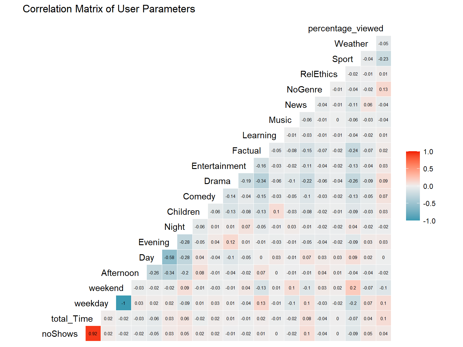
As expected, the self-excluding binary variables weekend and weekday have a perfect negative correlation. The same is true (though not to the same extend due to 4 variables) among single day times. We can also note a strong positive correlation between the number of shows watched and the total time watched. There is also some correlation between single genres such as Drama and Factual. A strong correlation would mean that we could reduce dimensions in our clustering analysis without losing much of the information. In addition, variables that are collinear pose the risk of having double the weight in the clustering analysis.
# box-whisker noShows
b1 <- userdatall %>%
      ggplot(aes(y = factor(0),
                 x = noShows))+
      geom_boxplot()+
      labs(title = "Number of Shows")+
      xlim(0, 40)

# histogram noShows
h1 <- userdatall %>%
      ggplot(aes(x = noShows))+
      geom_histogram()+
      scale_x_log10()+
      geom_segment(aes(x = mean(noShows),
                       y = 0, xend = mean(noShows),
                       yend = 3000),
                       colour = "black")+
      geom_segment(aes(x = median(noShows),
                       y = 0, xend = median(noShows),
                       yend = 3000),
                       colour = "grey")

# box-whisker total_Time
b2 <- userdatall %>%
      ggplot(aes(y = factor(0),
                 x = total_Time))+
      geom_boxplot()+
      labs(title = "Total time watched")+
      xlim(0, 300)

# histogram total_Time
h2 <- userdatall %>%
      ggplot(aes(x = total_Time))+
      geom_histogram()+
      scale_x_log10()+
      geom_segment(aes(x = mean(total_Time),
                       y = 0,
                       xend = mean(total_Time),
                       yend = 1000),
                       colour = "black")+
      geom_segment(aes(x = median(total_Time),
                       y = 0,
                       xend = median(total_Time),
                       yend = 1000),
                       colour = "grey")

# combine plots
(b1 + h1) / ( b2 + h2)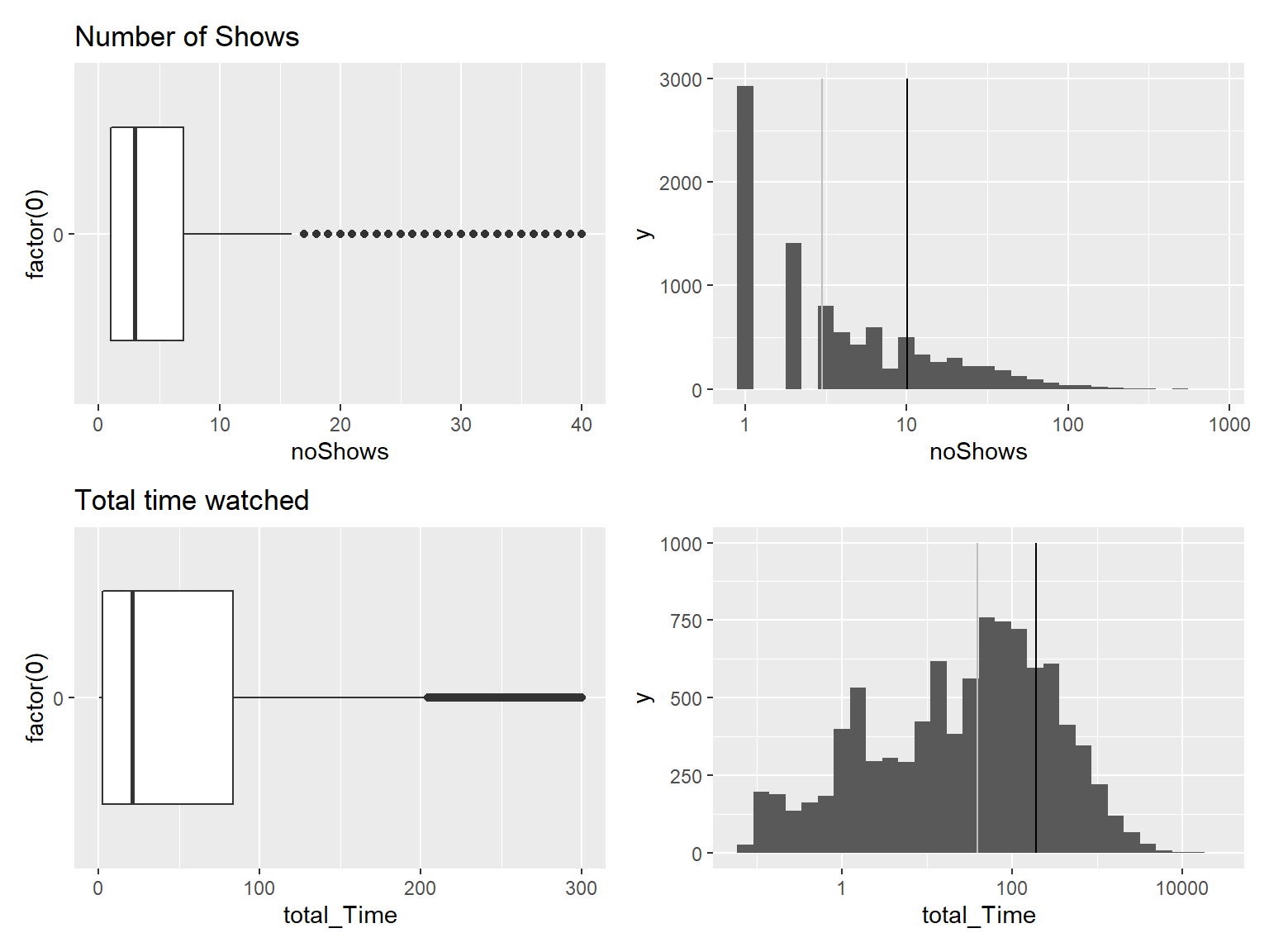
# total
plot1 <- userdatall %>%
         ggplot(aes(x = total_Time))+
         geom_histogram(bins = 15,
                        color = "white",
                        fill = "grey")+
         labs(title = "Total time data is heavily right skewed",
              subtitle = "Median (black) and mean (red) on log scale",
              y = "Count",
              x = "Total Time [min]")+
         geom_segment(aes(x = mean(total_Time),
                          y = 0,
                          xend = mean(total_Time),
                          yend = 1750),
                      colour = "darkred",
                      linetype = 2)+
         geom_segment(aes(x = median(total_Time),
                          y = 0,
                          xend = median(total_Time),
                          yend = 1750),
                      colour = "black",
                      linetype = 2)+
         theme_minimal()+
         ylim(0, 1750)+
         scale_x_continuous(trans = 'log10')+
         theme(text = element_text(family = "Roboto"),
               plot.title = element_text(face = "bold"))

plot1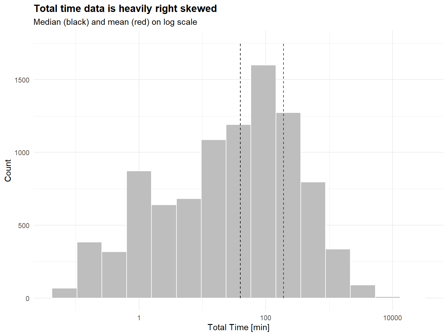
Note: The x-axis on the whisker plot has been cropped in order to be able to show the box, while the x-axis on the histogram has been transformed to a log10 scale to represent the heavily skewed data. This can also be seen by the median lying to the left of the mean.
Observation: Since both variables are highly correlated, we can expect to observe similar patterns. In both cases, we have numerous very infrequent users and a few high outliers. We need to consider these outliers in our cluster analysis distorting the cluster to include these extreme points.
Delete infrequent users
We will delete the records for users whose total view time is less than 5 minutes and who views 5 or fewer programs. These users are not very likely to be informative for clustering purposes. Or we can view these users as a ``low-engagement’’ cluster.
# delete users whose total view time is less than 5 minutes and who views 5 or fewer programs
userdata_red <- userdatall %>%
                filter(total_Time >= 5)%>%
                filter(noShows >= 5)

# distribution plot
ggplot(userdata_red,
       aes(x = total_Time))+
  geom_histogram(binwidth = 25)+
  labs(title = "User counts who in total watched > 5 shows or > 5 mins",
       x = "Total Time Watched (mins)",
       y = "Count")+
  xlim(0, 5000)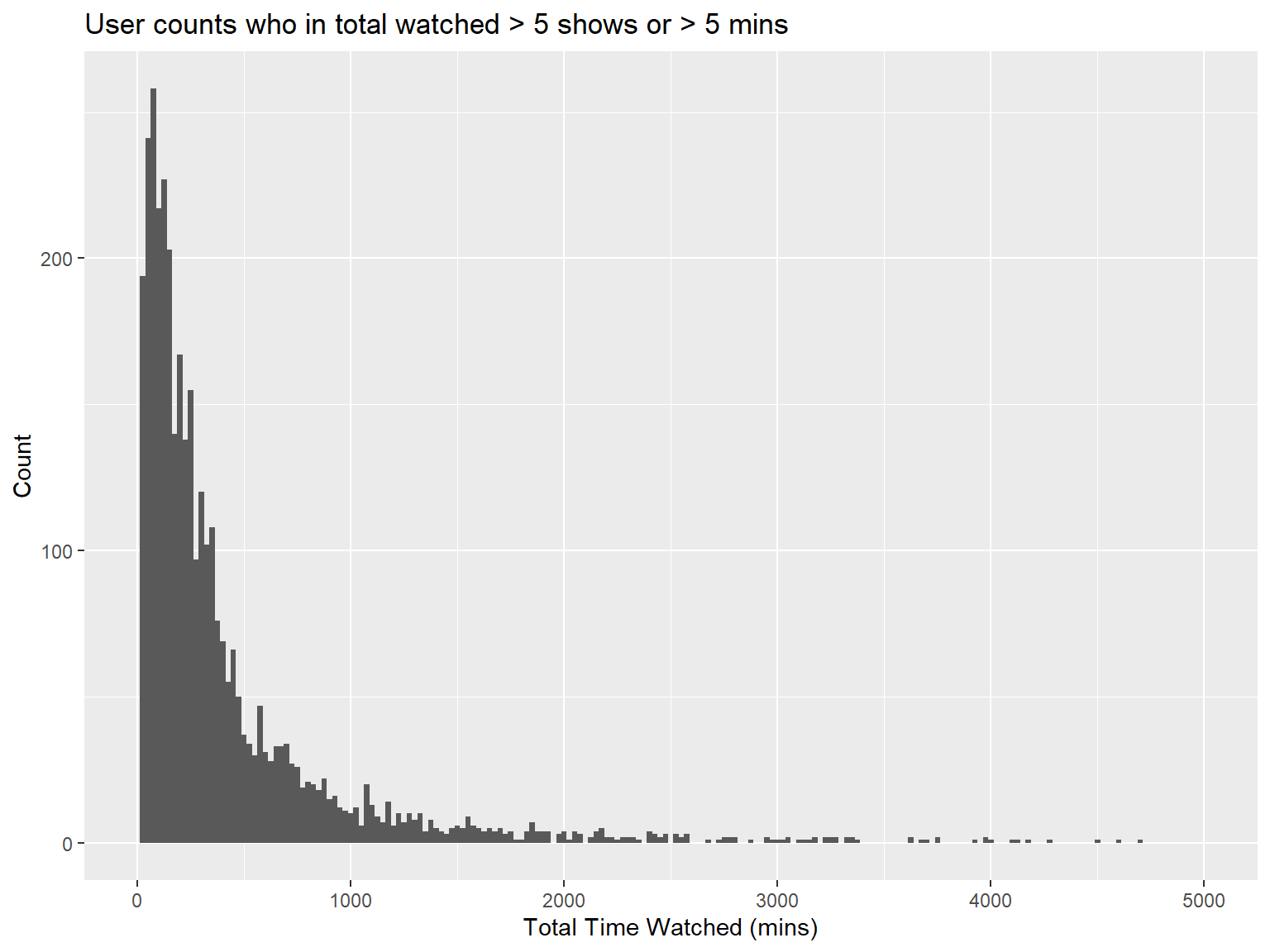
Clustering with K-Means
Now we are ready to find clusters in the BBC iPlayer viewers. We will start with the K-Means algorithm.
Training a K-Means Model
# get rid of variables that you might not need. Do not include no shows as well because it is highly correlated with total time
userData_clust <- userdata_red %>%
                  select(-user_id,
                         -weekday,
                         -noShows)

# log transform total time to reduce the impact of outliers
userData_clust <- userData_clust %>%
                  mutate(total_Time = log(total_Time))

# scale the data
userData_clust <- data.frame(scale(userData_clust))

# proofchecking scaling
print(mean(userData_clust$weekday))
## [1] NAprint(sd(userData_clust$weekday))## [1] NA# train kmeans clustering
model_kmeans_2clusters <- eclust(userData_clust,
"kmeans",
k = 2,
nstart = 50,
graph = FALSE)
# results of the clustering algorithm
summary(model_kmeans_2clusters)## Length Class Mode
## cluster 3625 -none- numeric
## centers 38 -none- numeric
## totss 1 -none- numeric
## withinss 2 -none- numeric
## tot.withinss 1 -none- numeric
## betweenss 1 -none- numeric
## size 2 -none- numeric
## iter 1 -none- numeric
## ifault 1 -none- numeric
## silinfo 3 -none- list
## nbclust 1 -none- numeric
## data 19 data.frame list# size of the two clusters
model_kmeans_2clusters$size## [1] 2390 1235# add clusters to the data frame
userData_clust_kmeans2 <- userData_clust %>%
mutate(cluster = as.factor(model_kmeans_2clusters$cluster))Comment: Of course increasing the random starts will increase the model performance but also the computing power required. According to the consulted literature 50 random starts is high enough to yield relevant results. The cluster sizes are of size 2390 and 1235.
Visualizing the results
Cluster centers
# creating new dataframe with cluster centers
cluster_centers_kmeans2 <- data.frame(cluster = as.factor(c(1:2)),
                                      model_kmeans_2clusters$centers)

# bringing the data in long format
cluster_centers_kmeans2_t <- cluster_centers_kmeans2 %>%
                             gather(variable,
                                    value,
                                    -cluster,
                                    factor_key = TRUE)

# create graph geom line and point, highlight average
p_centers_kmeans2 <- cluster_centers_kmeans2_t %>%
                     ggplot(aes(x = variable,
                                y = value)) +
                     geom_line(aes(color = cluster,
                                   group = cluster),
                               linetype = "dashed",
                               size = 1)+
                     geom_point(size = 1,
                                shape = 4)+
                     geom_hline(yintercept = 0)+
                     labs(title = "K-means Centers (k=2)")+
                     theme(text = element_text(size = 10),
                           axis.text.x = element_text(angle = 45,
                                                      hjust = 1))

p_centers_kmeans2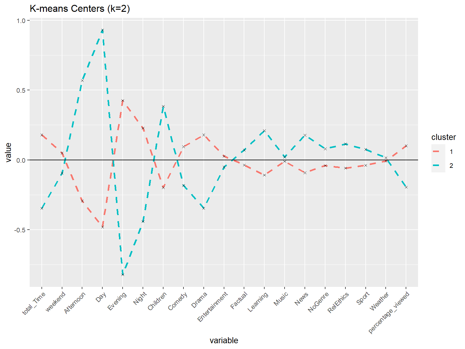
Interpretation: There seem to be some differences between the two clusters. We can see particular gaps in the period, cluster two tends to watch more in the day and afternoon, while cluster one watches more in the evening and night. Cluster two tends towards genres of children, learning and news. Cluster one on the other hand, watches more, with higher engagement and more likely drama genre.
A spontaneous association that could be plausible is that cluster two could represent a family household.
First educated guess: We could make suggestions to these two usertypes. In specific, by using according genre suggestions, duration of the shows and program ads at relevant times of the day.
Clusters vs variables
# plot in just two dimensions
userData_clust_kmeans2 %>%
  ggplot(aes(x = total_Time,
             y = weekend,
             color =  as.factor(cluster)))+
  geom_jitter()+
  labs(title = "K-means Cluster in two dimensions (k=2)",
       color = "Cluster")+
  theme_minimal()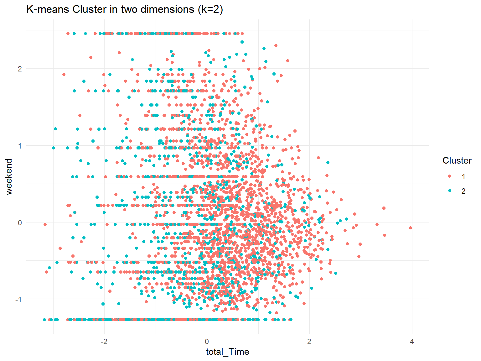
Interpretation: We can observe that the weekend variable does not show a clear pattern between one ore the other cluster. For total time on the other hand we can see a small tendency that customers of cluster 1 tend to be more on the right (higher time spend) compared to customers in cluster 2. This is also reflected in the line chart previously presented.
Clusters vs PCA components
# PCA in two dimensions
fviz_cluster(model_kmeans_2clusters,
             userData_clust,
             palette = "Set2",
             geom = "point",
             main = "K-means (k=2) cluster plot on two PC",
             ggtheme = theme_minimal())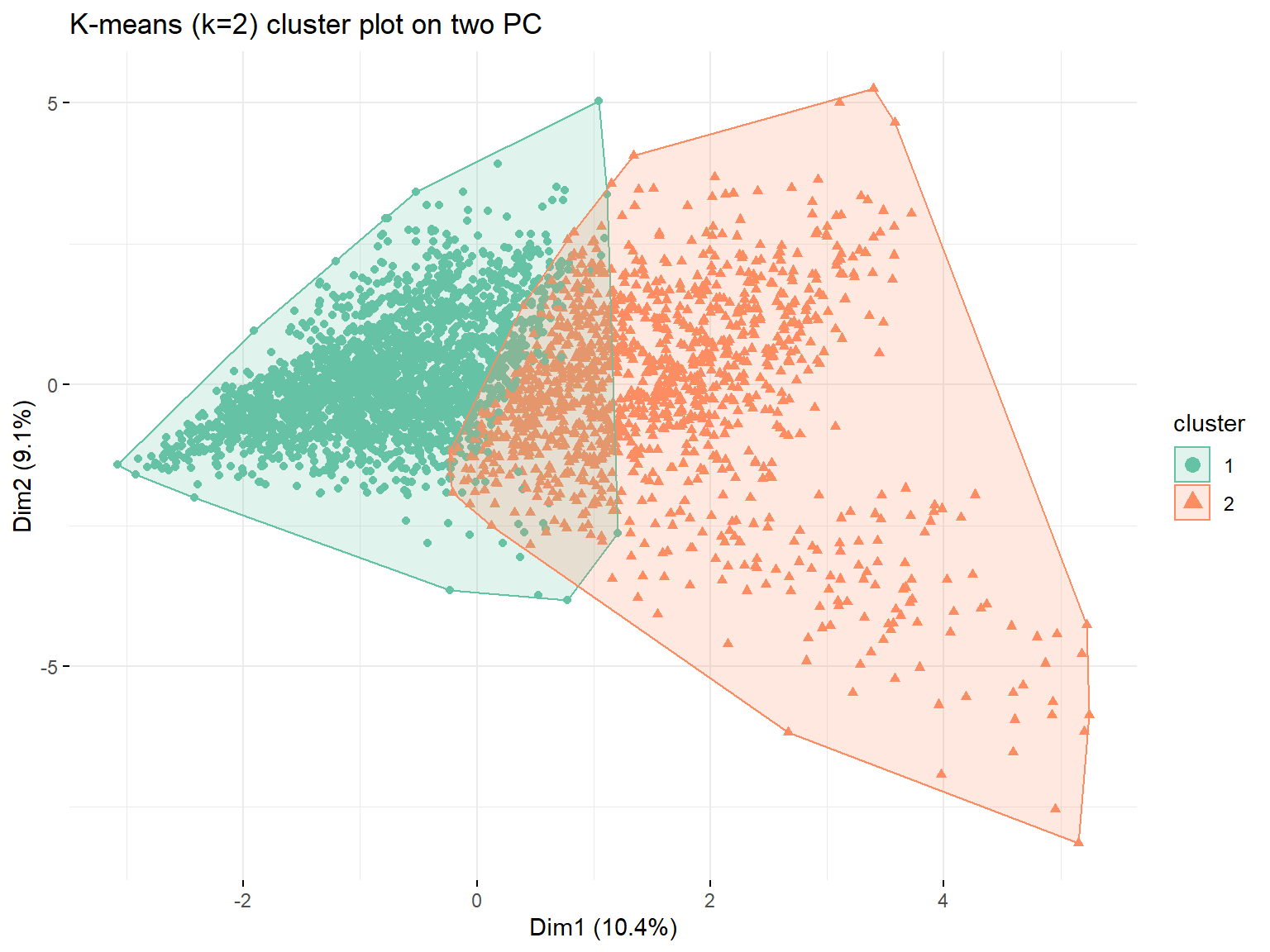
Although we can see a clear pattern especially on dimension 1, both clusters overlap significantly.
Clusters vs PCA components without log transform
# we do the same exercise just without the necessary data wrangling, variables are
# indicated with B for Bad

# this time we only get rid of user_id and weekday
userData_clustB <- userdata_red %>%
                   select(-user_id,
                          -weekday)

# we do not log transfor our data

# scale the data
userData_clustB <- data.frame(scale(userData_clustB))

# proofchecking scaling
print(mean(userData_clustB$total_Time))
## [1] -7.388845e-18print(sd(userData_clustB$total_Time))## [1] 1# train kmeans clustering Bad
model_kmeans_2clustersB <- eclust(userData_clustB,
"kmeans",
k = 2,
nstart = 50,
graph = FALSE)
# results of the clustering algorithm with Bad data
summary(model_kmeans_2clustersB)## Length Class Mode
## cluster 3625 -none- numeric
## centers 40 -none- numeric
## totss 1 -none- numeric
## withinss 2 -none- numeric
## tot.withinss 1 -none- numeric
## betweenss 1 -none- numeric
## size 2 -none- numeric
## iter 1 -none- numeric
## ifault 1 -none- numeric
## silinfo 3 -none- list
## nbclust 1 -none- numeric
## data 20 data.frame list# size of the two clusters with Bad data
model_kmeans_2clustersB$size## [1] 3443 182# add clusters to the data frame
userData_clust_kmeans2B <- userData_clustB %>%
mutate(cluster = as.factor(model_kmeans_2clustersB$cluster))
# creating new dataframe with cluster centers
cluster_centers_kmeans2B <- data.frame(cluster = as.factor(c(1:2)),
model_kmeans_2clustersB$centers)
# bringing the data in long format
cluster_centers_kmeans2_tB <- cluster_centers_kmeans2B %>%
gather(variable,
value,
-cluster,
factor_key = TRUE)
# create graph geom line and point, highlight average
cluster_centers_kmeans2_tB %>%
ggplot(aes(x = variable,
y = value))+
geom_line(aes(color = cluster,
group = cluster),
linetype = "dashed",
size = 1)+
geom_point(size = 1,
shape = 4)+
geom_hline(yintercept = 0)+
labs(title = "K-means Centers (k=2) - with Outliers")+
theme(text = element_text(size = 10),
axis.text.x = element_text(angle = 45,
hjust = 1),
axis.title = element_blank())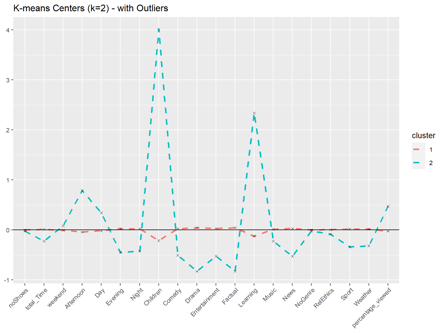
# plot in just two dimensions
userData_clust_kmeans2B %>%
  ggplot(aes(x = total_Time,
             y = weekend,
             color =  as.factor(cluster)))+
  geom_point()+
  labs(title = "K-means Cluster in two dimensions (k=2) - with Outliers",
       color = "Cluster")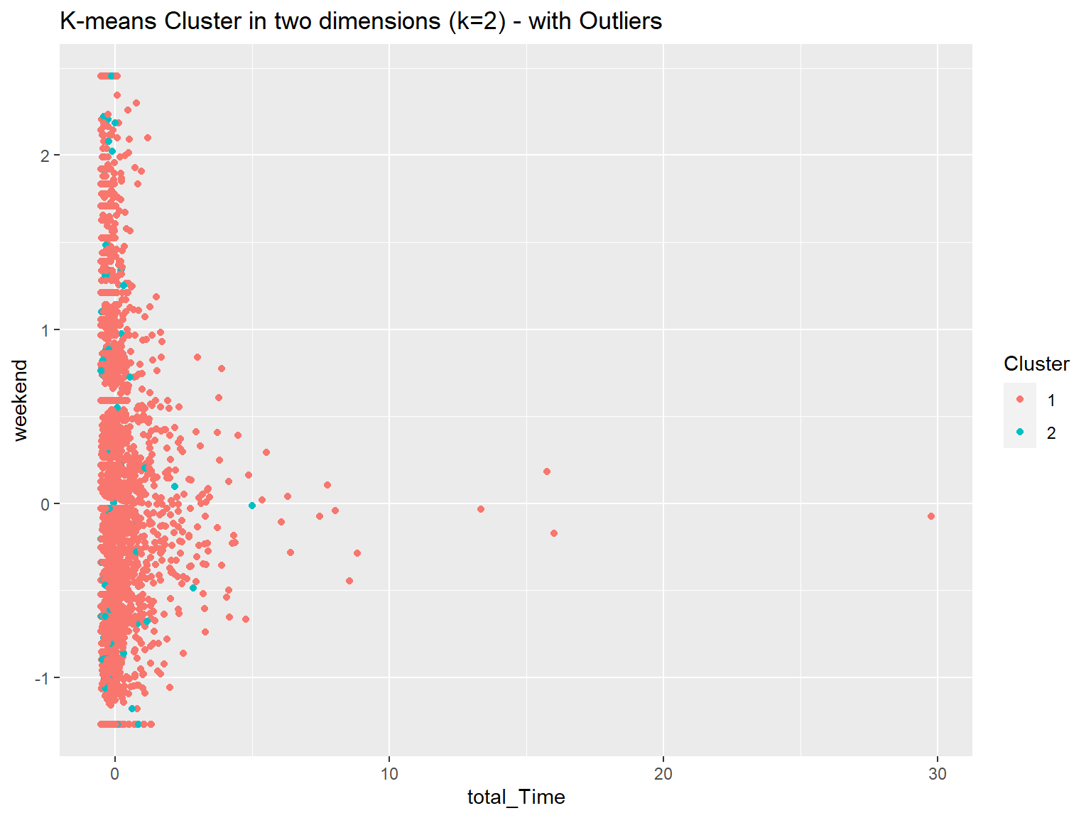
fviz_cluster(model_kmeans_2clustersB,
             userData_clustB,
             palette = "Set2",
             geom = "point",
             main = "K-means (k=2) cluster plot on two PC - with Outliers",
             ggtheme = theme_minimal())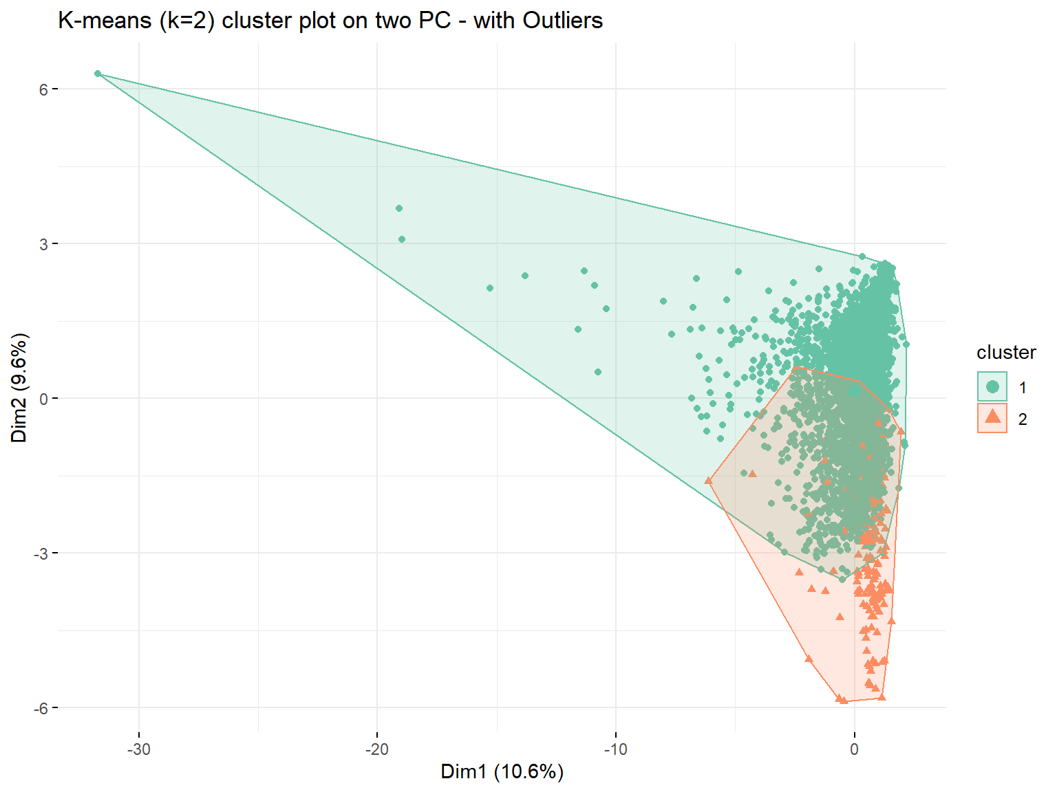
Observations: Yes there are some extreme outliers in both dimensions. We can further see that the cluster sizes are singificantly different (3443 and 182 compared to 2390 and 1235 whit log). In addition, the cluster centers for all variables of cluster 1 are close to zero and thus not very meaningful.
Elbow Chart
# creating an elbow chart with the fast method contained in package
fviz_nbclust(userData_clust,
             kmeans,
             method = "wss")+
  labs(subtitle = "Elbow method",
       y = "WCSS")+
  theme_bw()+
  scale_y_continuous()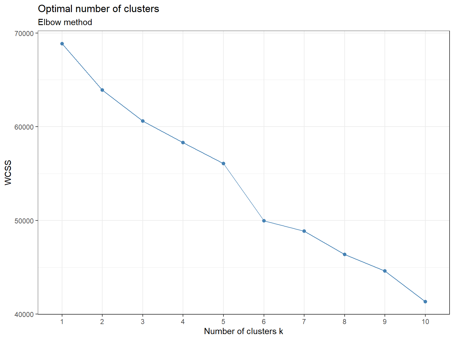
# alternative Approach --------------------------------------------------------

# use map_dbl to run K-Means models with varying value of k
tot_withinss <- map_dbl(1:10, function(k){
  model <- kmeans(x = userData_clust,
                  centers = k,
                  iter.max = 100,
                  nstart = 10)
  model$tot.withinss
})

# generate a data frame containing both k and tot_withinss
elbow_df <- data.frame(k = 1:10,
                       tot_withinss = tot_withinss)

# calculate difference
elbow_df <- elbow_df %>%
            mutate(tot_withinss = tot_withinss * (-1),
                   Diff = tot_withinss - lag(tot_withinss))

# print marginal improvement
improvement <- ggplot(elbow_df,
                      aes(x = k,
                          y = Diff)) +
               geom_line(color = "steelblue") +
               geom_point(color = "steelblue")+
               geom_vline(xintercept = 3,
                          linetype = 2)+
               labs(title = "Largest marginal improvement in k=2 & k=3",
                    subtitle = "Elbow method",
                    y = "Improvement WCSS",
                    x = "Number of cluster k")+
               scale_x_continuous(breaks = 1:10)+
               theme_minimal()+
               theme(panel.grid.minor.x = element_blank(),
                     text = element_text(family="Roboto"),
                     plot.title = element_text(face = "bold"))

improvement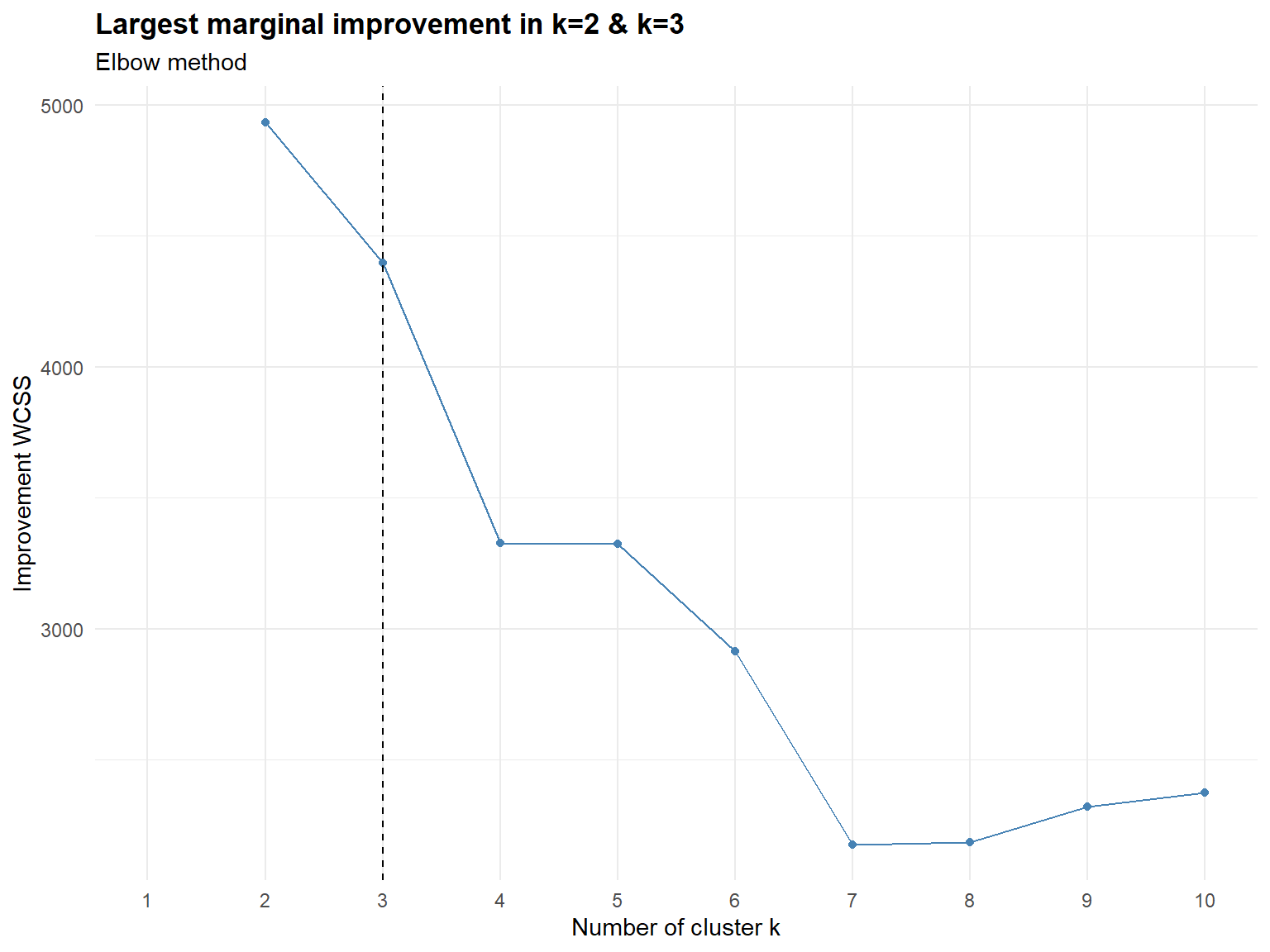
Silhouette method
# exemplary we plot the silhouette for two clusters
fviz_silhouette(model_kmeans_2clusters)+
  ggtitle(paste("k = 2",
                "avg sw=",
                format(round(model_kmeans_2clusters$silinfo$avg.width,3))))
## cluster size ave.sil.width
## 1 1 2390 0.22
## 2 2 1235 -0.04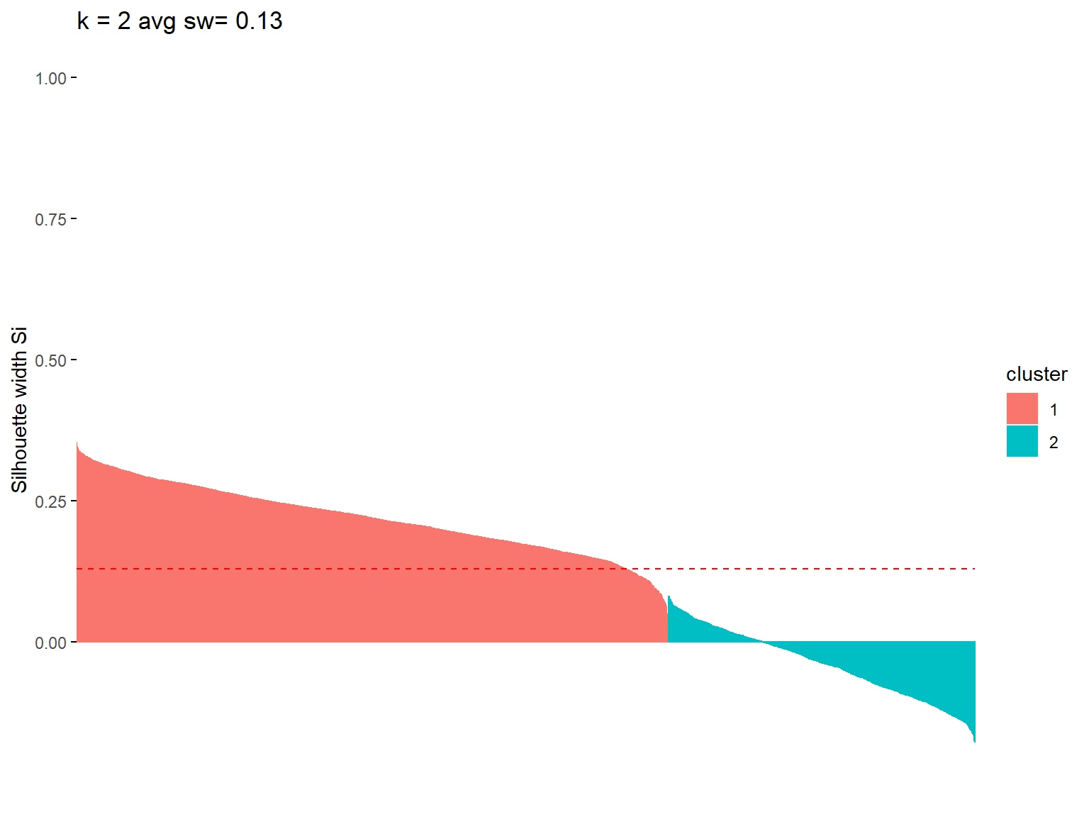
# and for seven clusters
model_kmeans_3clusters <- eclust(userData_clust,
                                 "kmeans",
                                 k = 3,
                                 nstart = 50,
                                 graph = FALSE)

fviz_silhouette(model_kmeans_3clusters)+
  ggtitle(paste("K-means (k=3) ",
                "| Mean sw=",
                format(round(model_kmeans_3clusters$silinfo$avg.width,
                             3))))
## cluster size ave.sil.width
## 1 1 1835 0.18
## 2 2 181 0.17
## 3 3 1609 0.00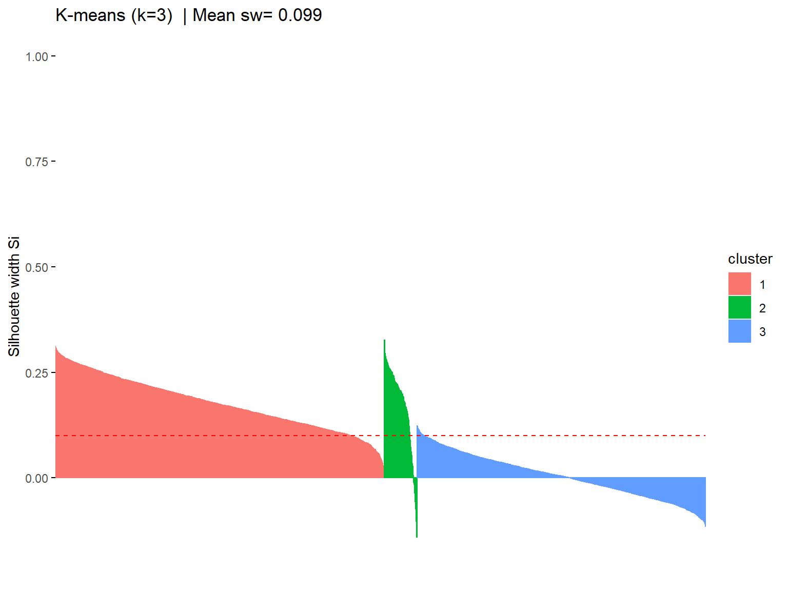
# using the factoextra library again to calculate optimal cluster count with silhouette method
fviz_nbclust(userData_clust,
             kmeans,
             method = "silhouette",
             k.max = 10)+
  labs(subtitle = "Silhouette method")+
  theme_bw()+
  scale_y_continuous()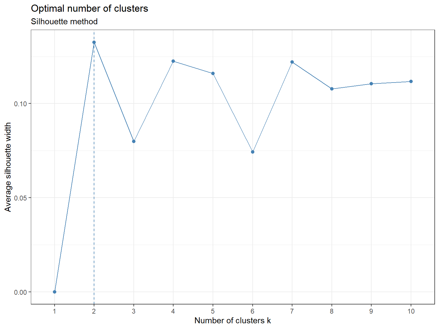
On the elbow chart we could see a significant drop from 5 to six clusters. From the silhouette analysis we can see that several cluster counts yield similar results. It is however surprising that two clusters have the highest average silhouette with. We would thus suggest avoiding very high and very low number of clusters and take a number of clusters that go along well with both methods, for example k = 7.
Comparing k-means with different k
# fit kmeans models for 2 - 5
model_kmeans_2clusters <- eclust(userData_clust,
                                 "kmeans",
                                 k = 2,
                                 nstart = 50,
                                 graph = FALSE)
model_kmeans_3clusters <- eclust(userData_clust,
                                 "kmeans",
                                 k = 3,
                                 nstart = 50,
                                 graph = FALSE)
model_kmeans_4clusters <- eclust(userData_clust,
                                 "kmeans",
                                 k = 4,
                                 nstart = 50,
                                 graph = FALSE)
model_kmeans_5clusters <- eclust(userData_clust,
                                 "kmeans",
                                 k = 5,
                                 nstart = 50,
                                 graph = FALSE)

# calculate Sizes and combine in one data frame
data.frame(cluster_number = c(1, 2, 3, 4, 5),
           kmeans_2 = c(model_kmeans_2clusters$size,0,0,0),
           kmeans_3 = c(model_kmeans_3clusters$size,0,0),
           kmeans_4 = c(model_kmeans_4clusters$size,0),
           kmeans_5 = model_kmeans_5clusters$size) %>%

kable()| cluster_number | kmeans_2 | kmeans_3 | kmeans_4 | kmeans_5 |
|---|---|---|---|---|
| 1 | 2390 | 1835 | 1621 | 182 |
| 2 | 1235 | 181 | 622 | 706 |
| 3 | 0 | 1609 | 181 | 811 |
| 4 | 0 | 0 | 1201 | 1073 |
| 5 | 0 | 0 | 0 | 853 |
# PCA visualizations

# PCA 2 again
pca2 <- fviz_cluster(model_kmeans_2clusters,
                     userData_clust,
                     palette = "Set2",
                     geom = "point",
                     main = "K-means (k=2) cluster plot on two PC",
                     ggtheme = theme_minimal())

# PCA 3
pca3 <- fviz_cluster(model_kmeans_3clusters,
                     userData_clust,
                     palette = "Set2",
                     geom = "point",
                     main = "K-means (k=3) cluster plot on two PC",
                     ggtheme = theme_minimal())

# PCA 4
pca4 <- fviz_cluster(model_kmeans_4clusters,
                     userData_clust,
                     palette = "Set2",
                     geom = "point",
                     main = "K-means (k=4) cluster plot on two PC",
                     ggtheme = theme_minimal())

# PCA 5
pca5 <- fviz_cluster(model_kmeans_5clusters,
                     userData_clust,
                     palette = "Set2",
                     geom = "point",
                     main = "K-means (k=5) cluster plot on two PC",
                     ggtheme = theme_minimal())

# combine graphs
(pca2 + pca3) / (pca4 + pca5)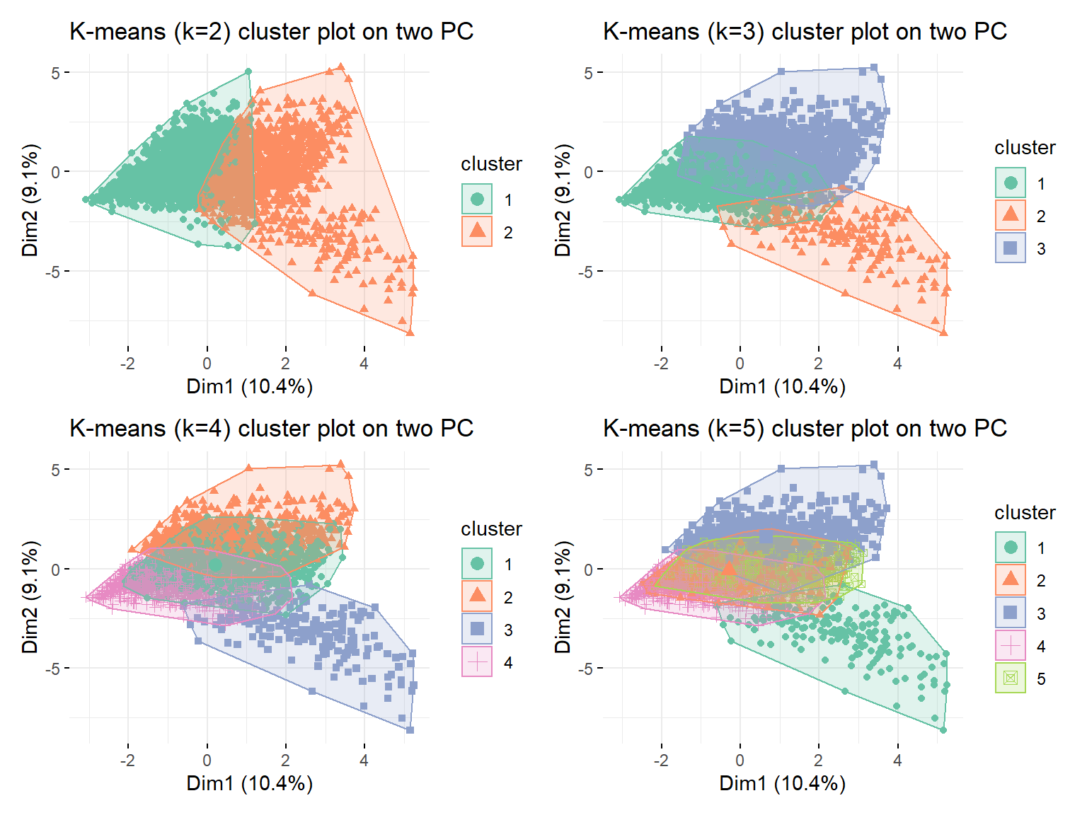
# k-means on two principal components
pca3_plot <- fviz_cluster(model_kmeans_3clusters,
                          userData_clust,
                          palette = "Set2",
                          geom = "point",
                          main = "K-means (k=3) on two Principal Components",
                          ggtheme = theme_minimal())

pca3_plot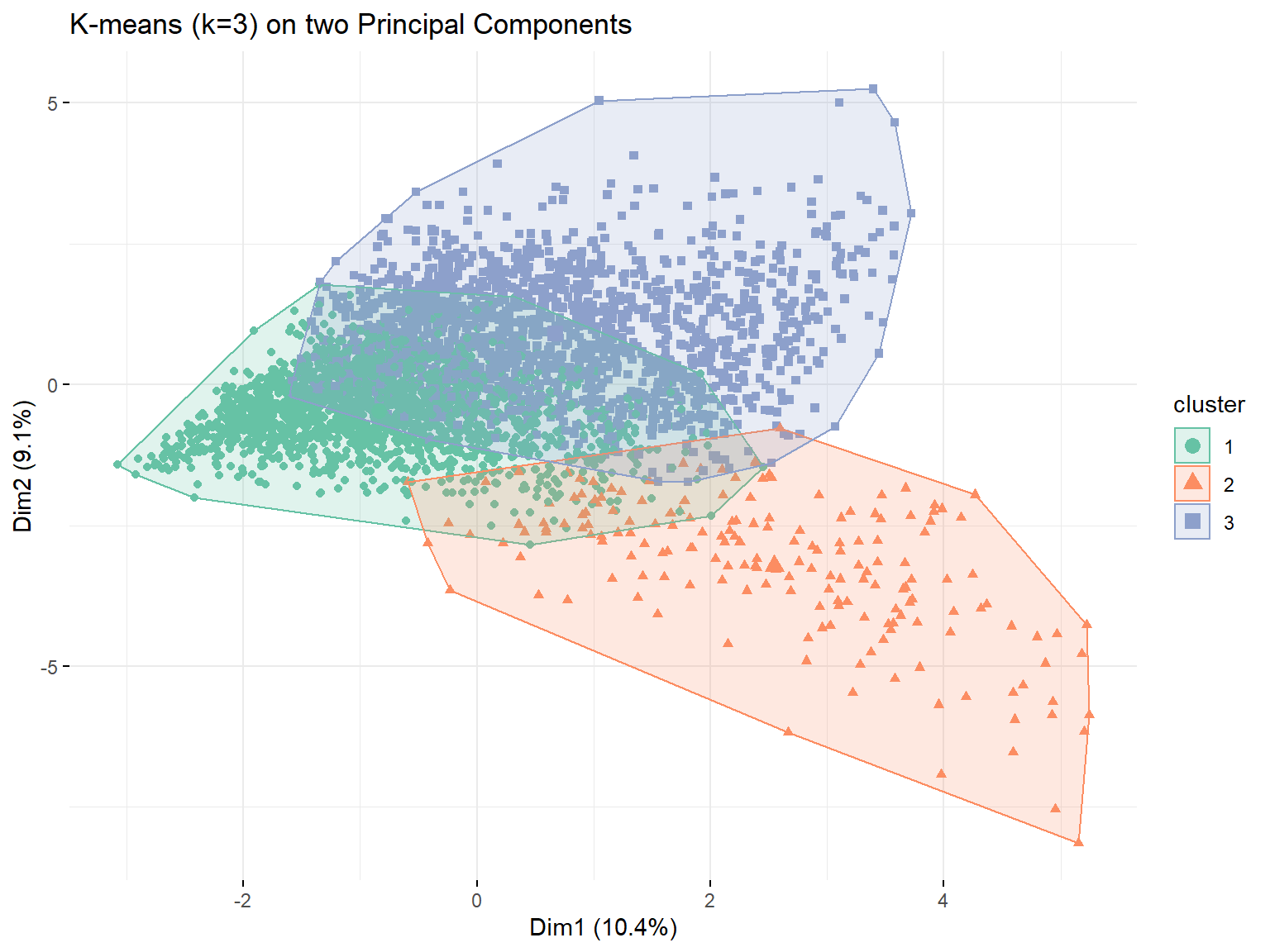
# add data
userData_clust_kmeans3 <- userData_clust %>%
                          mutate(cluster = as.factor(model_kmeans_3clusters$cluster))

pca4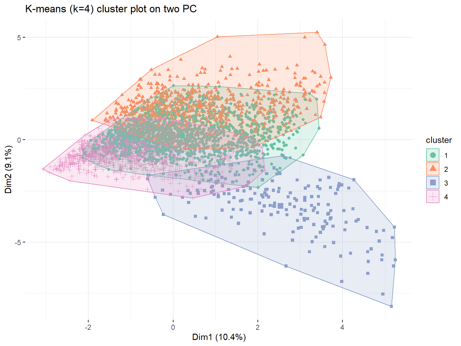
# Plot centers

# k2
k2 <- data.frame(cluster = as.factor(c(1:2)),
                 model_kmeans_2clusters$centers)

k2 <- k2 %>% gather(variable,
                    value,
                    -cluster,
                    factor_key = TRUE)

center2 <- ggplot(k2,
                  aes(x = variable, y = value))+
           geom_line(aes(color = cluster,
                         group = cluster),
                         linetype = "dashed",
                         size = 1)+
           geom_point(size = 1,
                      shape = 4)+
           geom_hline(yintercept = 0)+
           theme_minimal()+
           theme(text = element_text(size = 10),
                 axis.text.x = element_text(angle = 45,
                                            hjust = 1),
                 legend.title = element_text(size = 5),
                 legend.text = element_text(size = 5))+
           ggtitle("K-means Centers k=2")+
           theme(legend.position="bottom",
                 axis.title = element_blank())

# k3
k3 <- data.frame(cluster = as.factor(c(1:3)),
                 model_kmeans_3clusters$centers)
k3_t <- k3 %>%
        gather(variable,
               value,
               -cluster,
               factor_key = TRUE)

center3 <- ggplot(k3_t,
                  aes(x = variable,
                      y = value))+
           geom_line(aes(color = cluster,
                     group = cluster),
                     linetype = "dashed",
                     size = 1)+
           geom_point(size = 1,
                      shape = 4)+
           geom_hline(yintercept = 0)+
           theme_minimal()+
           theme(text = element_text(size = 10),
                 axis.text.x = element_text(angle = 45,
                                            hjust = 1),
                 legend.title = element_text(size = 5),
                 legend.text = element_text(size = 5))+
           ggtitle("K-means Centers k=3")+
           theme(legend.position = "bottom",
                 axis.title = element_blank())

bar3 <- ggplot(k3_t,
               aes(y = variable,
                   x = value,
                   fill = cluster)) +
        geom_bar(position = "dodge",
                 stat = "identity",
                 width = 0.7)+
        labs(title = "K-means k = 3",
             subtitle = "Cluster Centers",
             y = "",
             x = "Normalized Center")+
        theme_minimal()+
        theme(panel.grid.minor.x = element_blank(),
              text=element_text(family = "Roboto"),
              plot.title = element_text(face = "bold"))+
        scale_fill_discrete(name = "Cluster",
                            labels = c("The Connoisseur", "The Didactic", "The Informed"))

bar3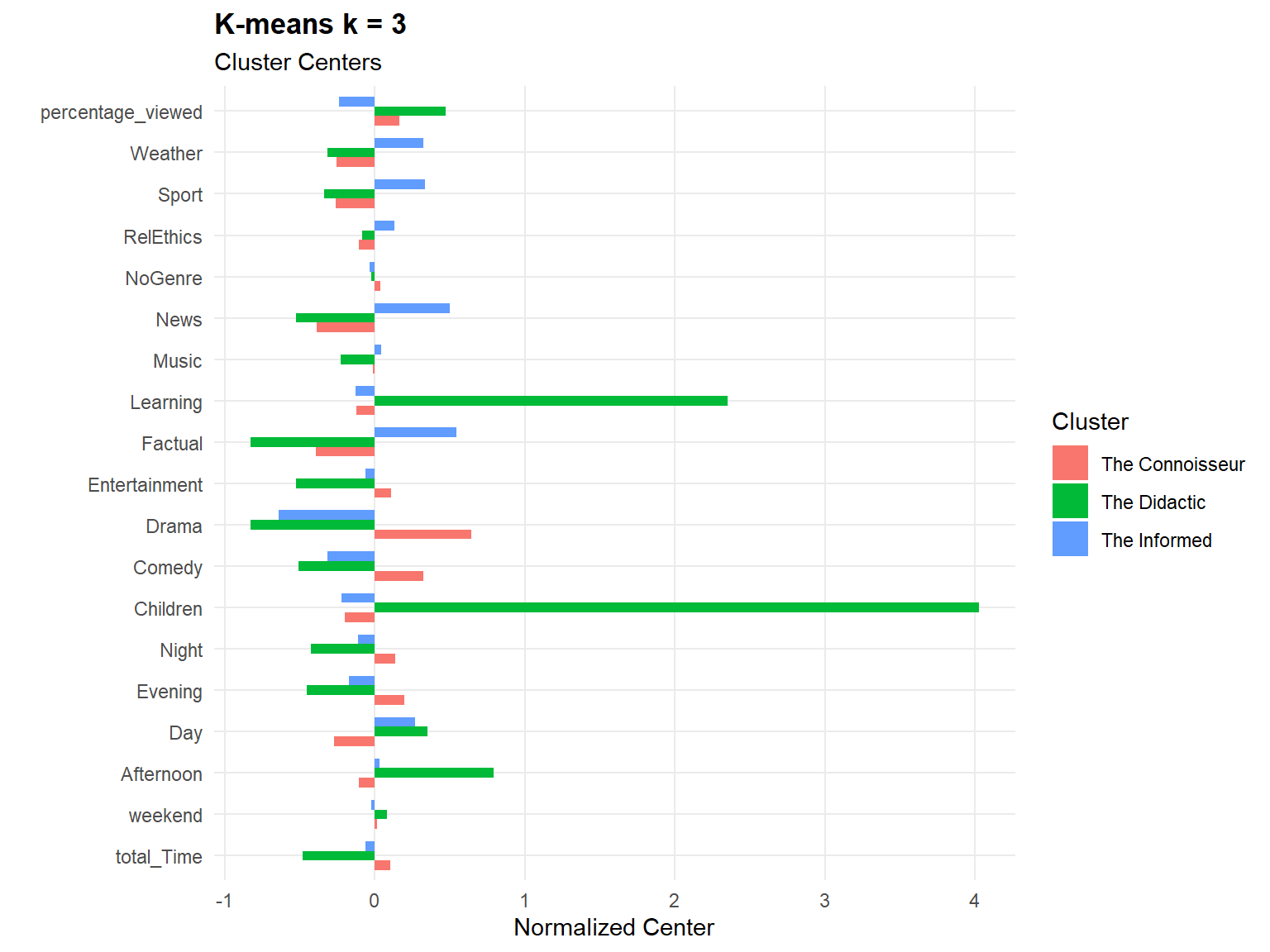
# k4
k4 <- data.frame(cluster = as.factor(c(1:4)),
                 model_kmeans_4clusters$centers)
k4 <- k4 %>%
      gather(variable,
             value,
             -cluster,
             factor_key = TRUE)

center4 <- ggplot(k4,
                  aes(x = variable,
                      y = value))+
           geom_line(aes(color = cluster,
                         group = cluster),
                         linetype = "dashed",
                         size = 1)+
           geom_point(size = 1,
                      shape = 4)+
           geom_hline(yintercept = 0)+
           theme_minimal()+
           theme(text = element_text(size = 10),
                 axis.text.x = element_text(angle = 45,
                                            hjust = 1),
                 legend.title = element_text(size = 5),
                 legend.text = element_text(size = 5))+
           ggtitle("K-means Centers k=4")+
           theme(legend.position = "bottom",
                 axis.title = element_blank())

# k5
k5 <- data.frame(cluster = as.factor(c(1:5)),
                 model_kmeans_5clusters$centers)
k5 <- k5 %>%
      gather(variable,
             value,
             -cluster,
             factor_key = TRUE)

center5 <- ggplot(k5,
                  aes(x = variable,
                      y = value))+
           geom_line(aes(color = cluster,
                         group = cluster),
                         linetype = "dashed",
                         size = 1)+
           geom_point(size = 1,
                      shape = 4)+
           geom_hline(yintercept = 0)+
           theme_minimal()+
           theme(text = element_text(size = 10),
                 axis.text.x = element_text(angle = 45,
                                            hjust = 1),
                 legend.title = element_text(size = 5),
                 legend.text = element_text(size = 5))+
           ggtitle("K-means Centers k=5")+
           theme(legend.position = "bottom",
                 axis.title = element_blank())

center2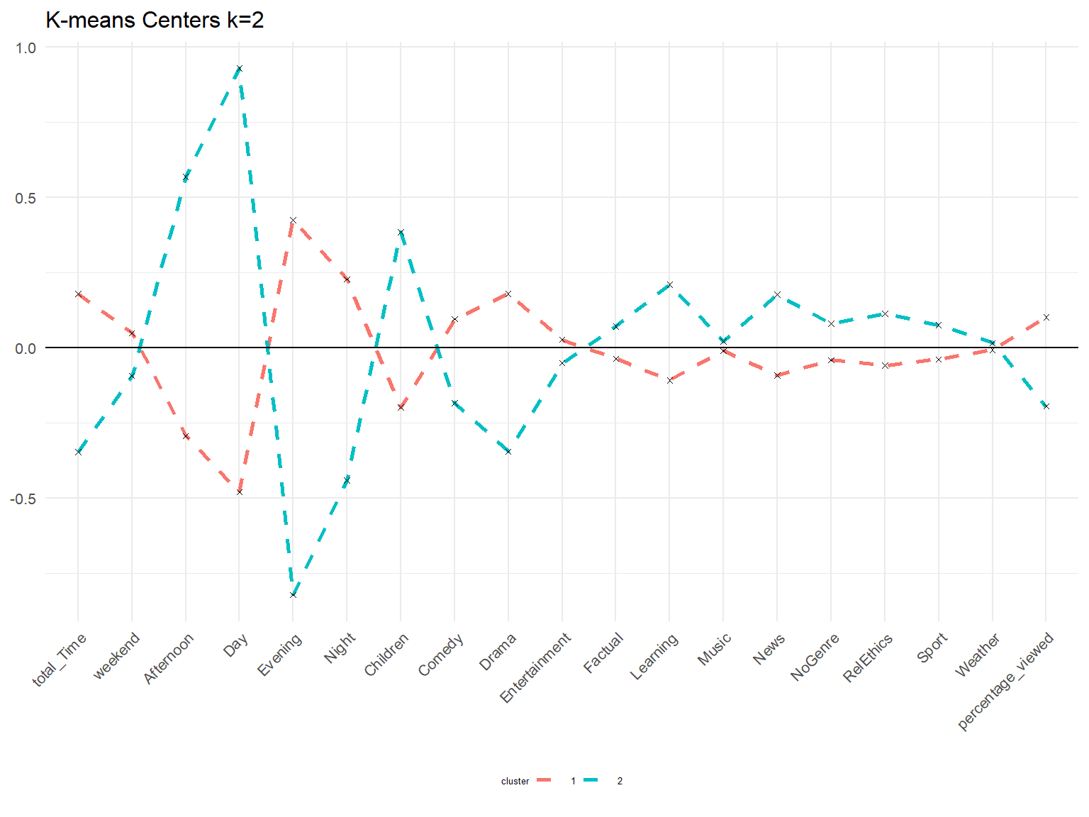
center3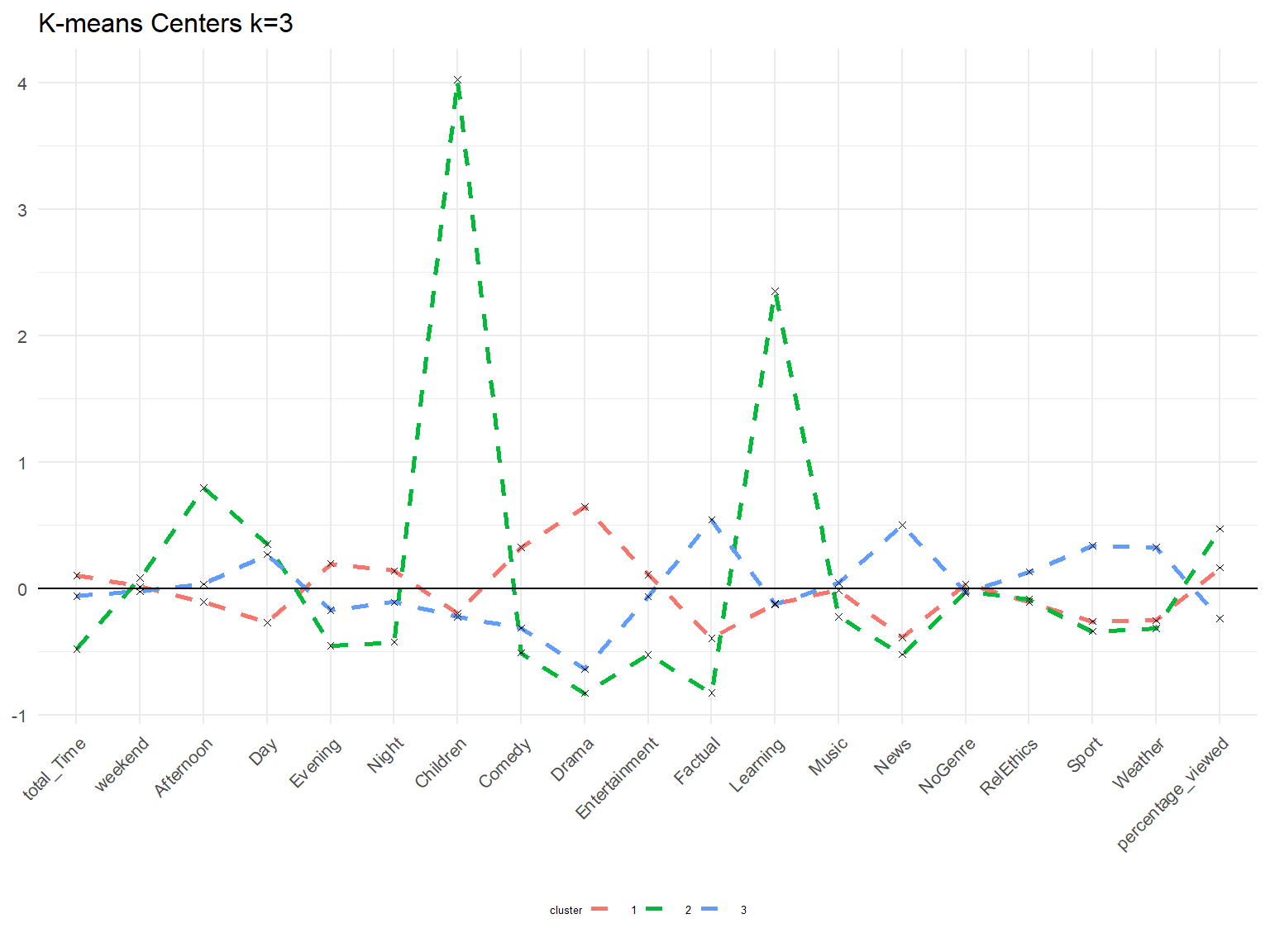
center4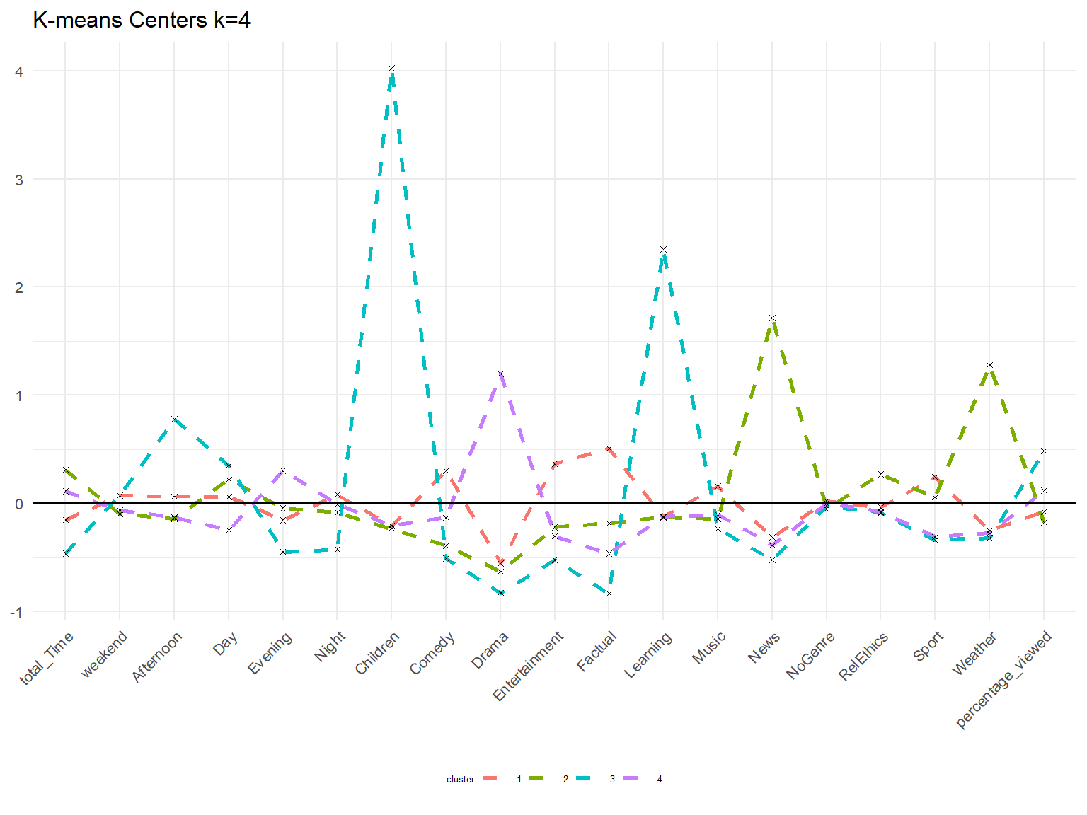
center5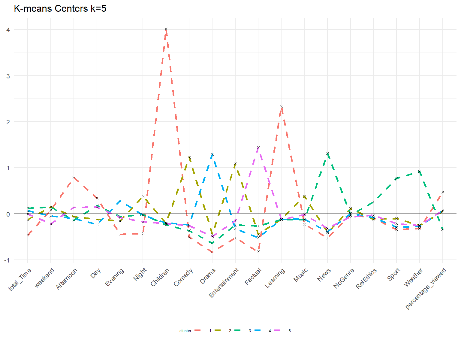
Interpretation: The cluster 2 focussing on children and learning becomes very pronounced with k = 3. We can also see customers in cluster 3 that focus on news, weather, sport, factual during the day. With k = 4 we can see that factual and news now are contained in two different clusters with the latter going along with weather. With k = 5 we can see a customer emerging that likes comedy, entertainment, and music at night.
Interpretation: From the PCA analysis we would tend to exclude k4 and k5 since we can observe large overlaps. When looking at cluster center, we can however see that new clusters emerge that have distinct characteristics. Also the cluster sizes become more similar to each other.
Comparing results of different clustering algorithms
PAM
# partitioning around metoids for k = 3

# create model
k3_pam <- eclust(userData_clust,
                 "pam",
                 k = 3,
                 graph = FALSE)

# calculate cluster sizes
k3_pam$clusinfo[1:3,1:1]
## [1] 1795 537 1293# PAM Medoids
# generating new data frame with cluster medoids and cluster numbers
cluster_medoids <- data.frame(cluster = as.factor(c(1:3)),
k3_pam$medoids)
# transpose this data frame
cluster_medoids <- cluster_medoids %>%
gather(variable,
value,
-cluster,
factor_key = TRUE)
# plot medoids
pMedoids <- cluster_medoids %>%
ggplot(aes(x = variable,
y = value))+
geom_line(aes(color = cluster,
group = cluster),
linetype = "dashed",
size = 1)+
geom_point(size = 1,
shape = 4)+
geom_hline(yintercept = 0)+
labs(title = "PAM Medoids k=3")+
theme(text = element_text(size = 10),
axis.text.x = element_text(angle = 45,
hjust = 1))+
theme(legend.position = "bottom",
axis.title = element_blank())
# PAM Centers
# generating new data frame with cluster centers and cluster numbers
pam_centers <- userData_clust %>%
mutate(cluster = as.factor(k3_pam$cluster))
pam_centers <- pam_centers %>%
group_by(cluster) %>%
summarize_at(vars(total_Time:percentage_viewed),
mean)
# gather to bring in long format
pam_centers_t <- gather(pam_centers,
key = "variable",
value = "value",
-cluster,
factor_key = TRUE)
# ggplot to visualize centers
pCenters <- pam_centers_t %>%
ggplot(aes(x = variable,
y = value))+
geom_line(aes(color = cluster,
group = cluster),
linetype = "dashed",
size = 1)+
geom_point(size = 1,
shape = 4)+
geom_hline(yintercept = 0)+
labs(title ="PAM Centers k= 3",
fill = "Cluster")+
theme(text = element_text(size = 10),
axis.text.x = element_text(angle = 45,
hjust = 1),
legend.title = element_text(size = 5),
legend.text = element_text(size = 5))+
theme(legend.position = "bottom",
axis.title = element_blank())
pMedoids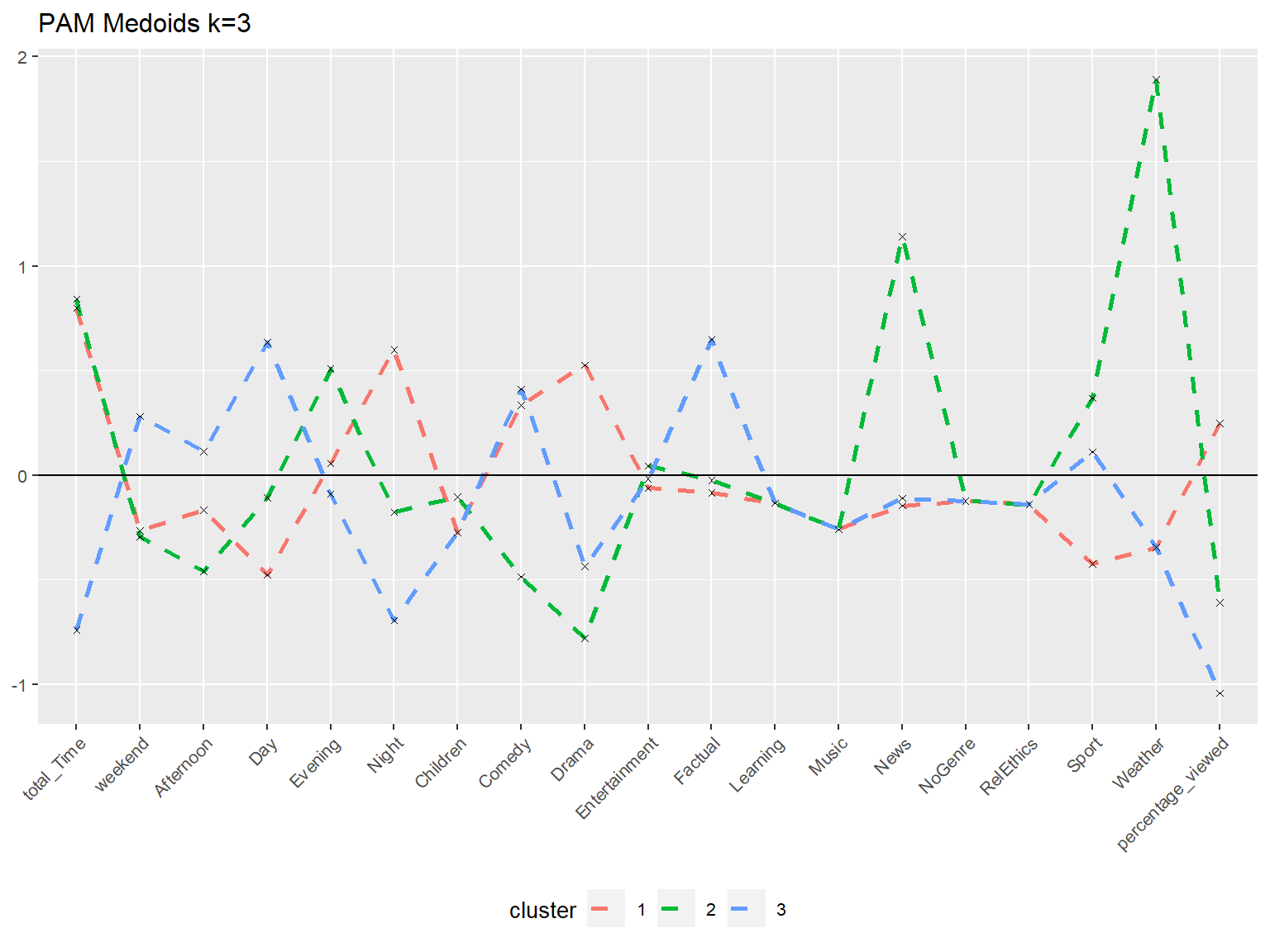
pCenters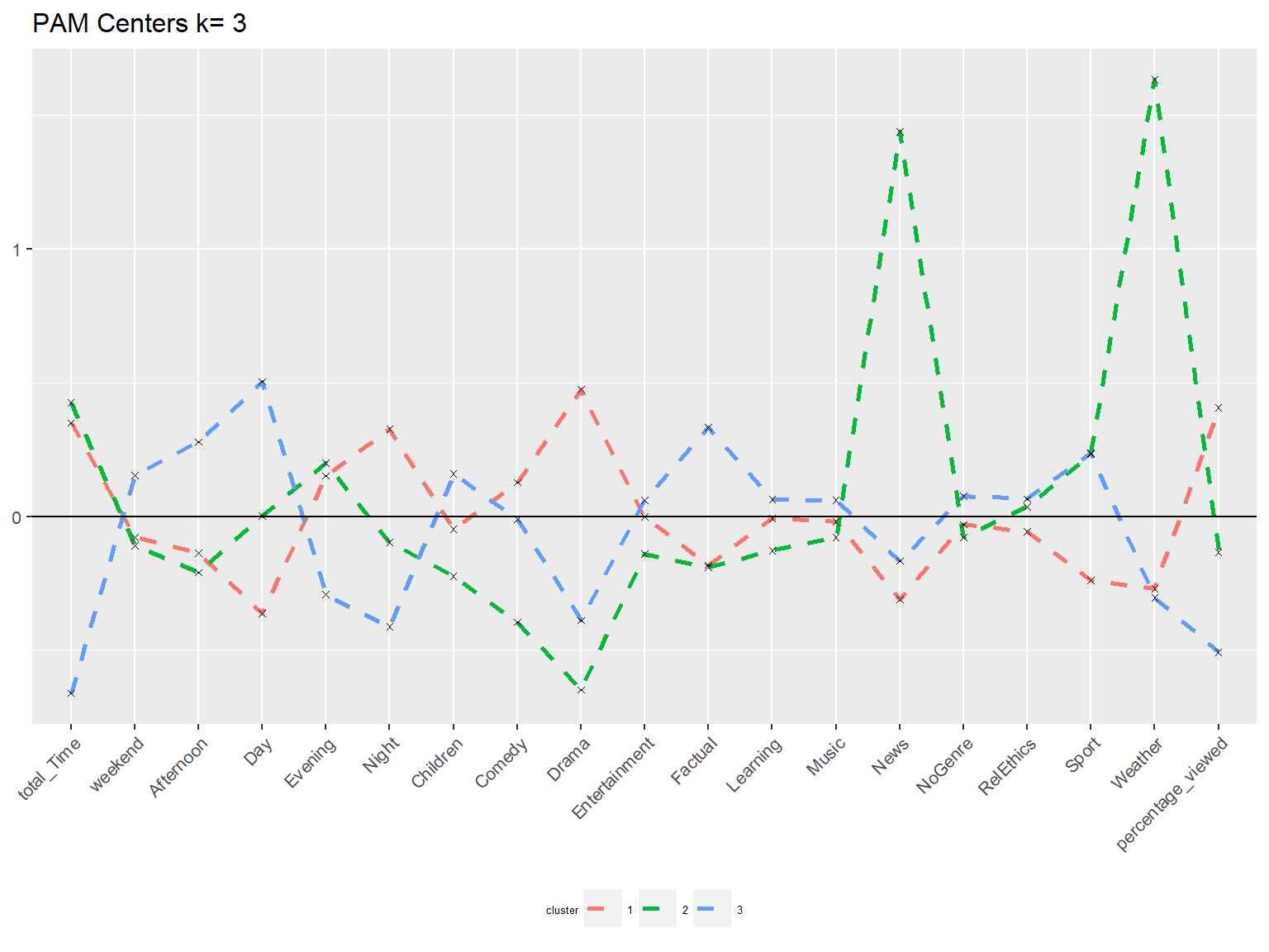
# PCA in two dimensions
pca_pam <- fviz_cluster(k3_pam,
                        userData_clust,
                        palette = "Set2",
                        geom = "point",
                        main = "PAM (k=3) cluster plot on two PC",
                        ggtheme = theme_minimal())

pca_pam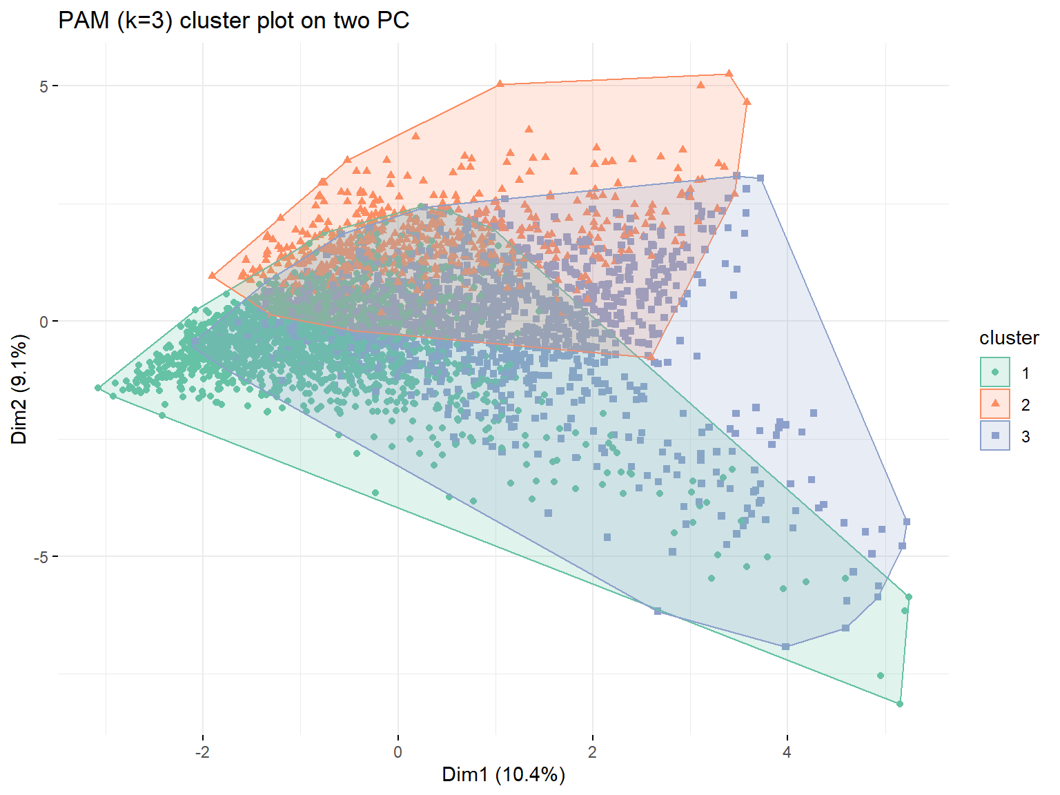
H-Clustering
# calculating distances between points first
res_dist <- dist(userData_clust,
                 method = "euclidean")

# h with average
h_average <- hcut(res_dist,
                  hc_method = "average",
                  k = 3)
summary(h_average)
## Length Class Mode
## merge 7248 -none- numeric
## height 3624 -none- numeric
## order 3625 -none- numeric
## labels 0 -none- NULL
## method 1 -none- character
## call 3 -none- call
## dist.method 1 -none- character
## cluster 3625 -none- numeric
## nbclust 1 -none- numeric
## silinfo 3 -none- list
## size 3 -none- numeric
## data 6568500 dist numericplot(h_average,
hang = -1,
cex = 0.5)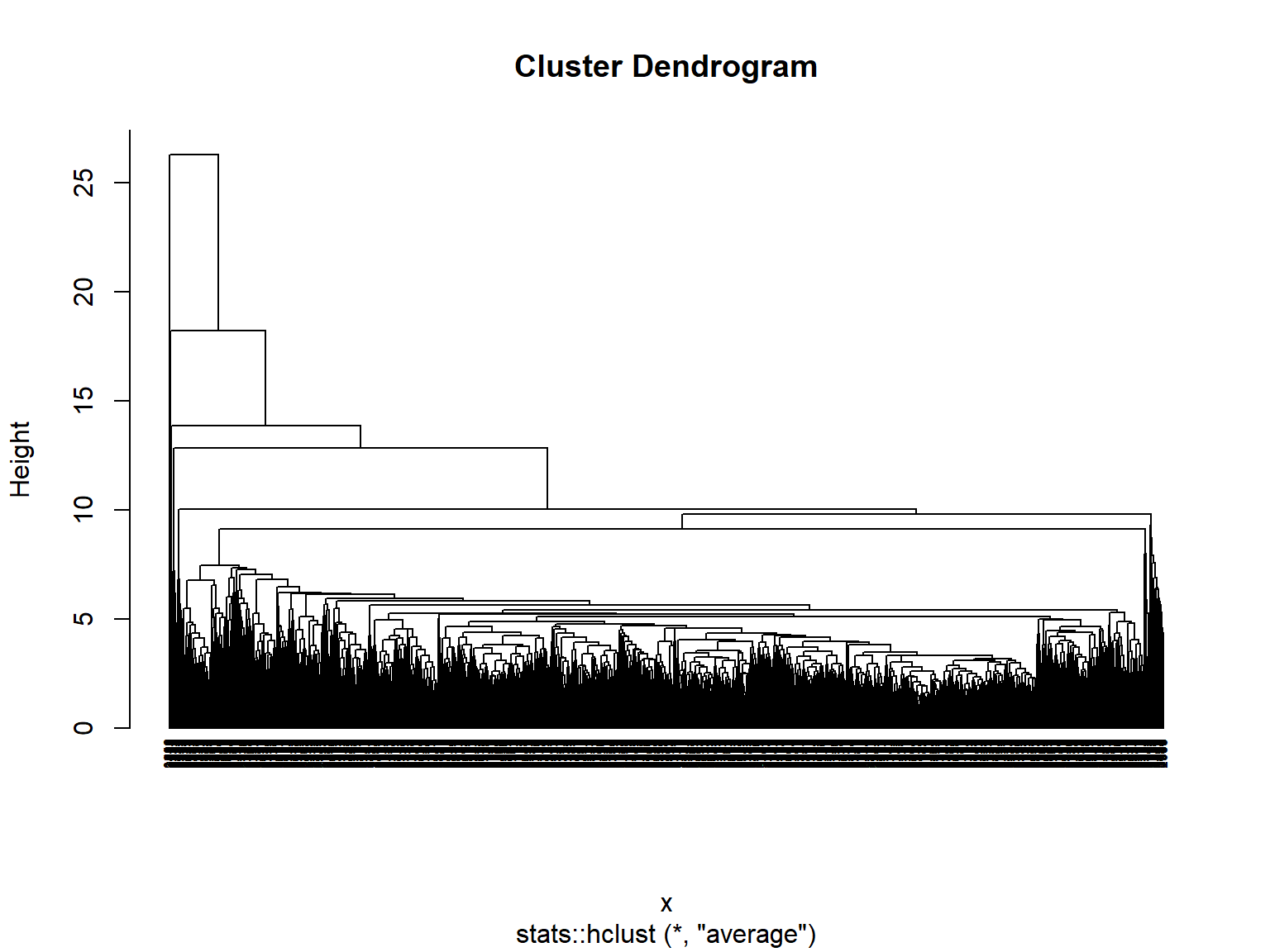
# h with ward
h_ward <- hcut(res_dist,
               hc_method = "ward.D",
               k = 3)
summary(h_ward)
## Length Class Mode
## merge 7248 -none- numeric
## height 3624 -none- numeric
## order 3625 -none- numeric
## labels 0 -none- NULL
## method 1 -none- character
## call 3 -none- call
## dist.method 1 -none- character
## cluster 3625 -none- numeric
## nbclust 1 -none- numeric
## silinfo 3 -none- list
## size 3 -none- numeric
## data 6568500 dist numericplot(h_ward,hang = -1,
cex = 0.5)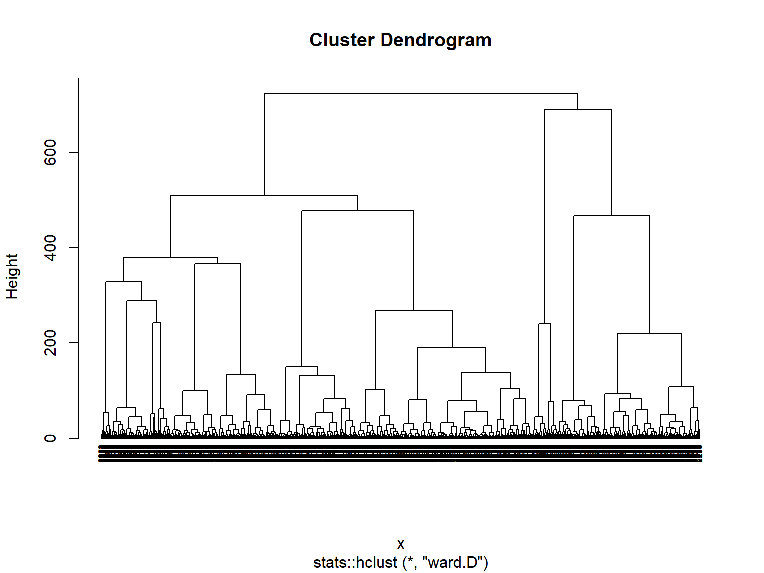
# comparison of sizes
data.frame(average = h_average$size,
           ward = h_ward$size) %>%
kable()| average | ward |
|---|---|
| 3622 | 2610 |
| 1 | 863 |
| 2 | 152 |
# r average

# generating new data frame with cluster centers and cluster numbers
h_average_centers <- userData_clust %>%
                     mutate(cluster = as.factor(h_average$cluster))

h_average_centers <- h_average_centers %>%
                     group_by(cluster) %>%
                     summarize_at(vars(total_Time:percentage_viewed),
                                  mean)

# gather to bring in long format
h_average_centers <- gather(h_average_centers,
                            key = "variable",
                            value = "value",
                            -cluster,
                            factor_key = TRUE)

# ggplot to visualize centers
pCenters_h_average <- h_average_centers %>%
                      ggplot(aes(x = variable,
                                 y = value))+
                      geom_line(aes(color = cluster,
                                    group = cluster),
                                linetype = "dashed",
                                size = 1)+
                      geom_point(size = 1,shape = 4)+
                      geom_hline(yintercept = 0)+
                      labs(title = "H average Centers k = 3",
                           fill = "Cluster")+
                      theme(text = element_text(size = 10),
                            axis.text.x = element_text(angle = 45,
                                                       hjust = 1),
                            legend.title = element_text(size = 5),
                            legend.text = element_text(size = 5))+
                      theme(legend.position = "bottom",
                            axis.title=element_blank())

pCenters_h_average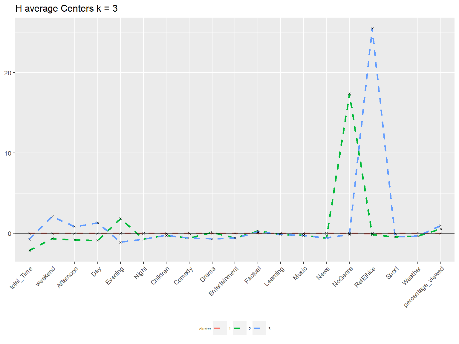
# r ward

# generating new data frame with cluster centers and cluster numbers
h_ward_centers <- userData_clust %>%
                  mutate(cluster = as.factor(h_ward$cluster))

h_ward_centers <- h_ward_centers %>%
                  group_by(cluster) %>%
                  summarize_at(vars(total_Time:percentage_viewed),
                               mean)

h_ward_centers <- h_ward_centers %>%
                  mutate(cluster = c(1,3,2)) %>%
                  arrange(cluster) %>%
                  mutate(cluster = as.factor(cluster))

# gather to bring in long format
h_ward_centers_t <- gather(h_ward_centers,
                           key = "variable",
                           value = "value",
                           -cluster,
                           factor_key = TRUE)


# transpose matrix
# h_ward_centers_transposed

# ggplot to visualize centers
pCenters_h_ward <- h_ward_centers_t %>%
                   ggplot(aes(x = variable,
                              y = value))+
                   geom_line(aes(color = cluster,
                                 group = cluster),
                             linetype = "dashed",
                             size = 0.6)+
                   geom_point(size = 1,
                              shape = 4)+
                   geom_hline(yintercept = 0)+
                   labs(title = "H-ward k = 3",
                        subtitle = "Cluster Centers")+
                   scale_color_manual(values = c("#F8766D", "#00BA38", "#619CFF"),
                                      name = "Cluster",
                                      labels = c("The Connoisseur", "The Didactic", "The Informed"))+
                   theme_minimal()+
                   theme(text = element_text(size = 10),
                         axis.text.x = element_text(angle = 45,
                                                    hjust = 1),
                         legend.title=element_text(size = 5),
                         legend.text = element_text(size = 5))+
                   theme(axis.title=element_blank(),
                         text=element_text(family="Roboto"),
                         plot.title = element_text(face = "bold"))

# F8766D red
# 00BA38 green
# 619CFF blue

pCenters_h_ward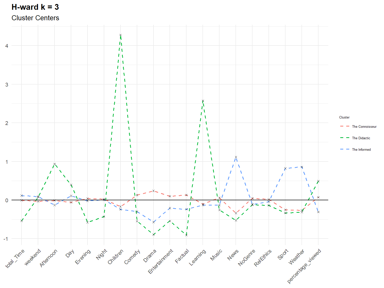
# PCA average
pca_h_average <- fviz_cluster(h_average,
                              userData_clust,
                              palette = "Set2",
                              geom = "point",
                              main = "H average (k=3) cluster plot on two PC",
                              ggtheme = theme_minimal())

# PCA ward
pca_h_ward <- fviz_cluster(h_ward,
                           userData_clust,
                           palette = "Set2",
                           geom = "point",
                           main = "H ward (k=3) cluster plot on two PC",
                           ggtheme = theme_minimal())
Let’s plot the centers of H-clusters and compare the results with K-Means and PAM.
# comparison of center plots

# (center3 + pCenters) / (pCenters_h_average + pCenters_h_ward)

# comparison of pca plots
(pca3 + pca_pam) / (pca_h_average + pca_h_ward)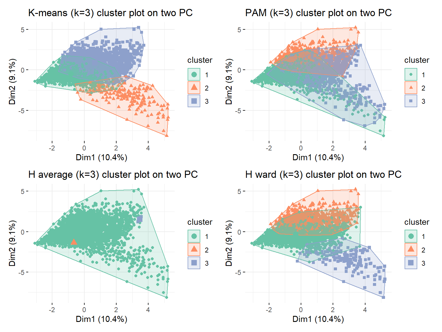
# extracting same cluster from different methods
c2_k3 <- k3 %>%
         filter(cluster == 2) %>%
         mutate(cluster = "k_means")

c3_pam_centers <- pam_centers %>%
                  filter(cluster == 3) %>%
                  mutate(cluster = "pam")

c3_h_ward_centers <- h_ward_centers %>%
                     filter(cluster == 3) %>%
                     mutate(cluster = "ward")


# combining and putting in long format
method_centers <- rbind(c2_k3,
                        c3_pam_centers,
                        c3_h_ward_centers)

method_centers_t <- gather(method_centers,
                           key = "variable",
                           value = "value",
                           -cluster,
                           factor_key = TRUE)

# plotting
bar_methods <- ggplot(method_centers_t,
                      aes(y = variable,
                          x = value,
                          fill = cluster)) +
               geom_bar(position = "dodge",
                        stat = "identity",
                        width = 0.7)+
               labs(title = "K-means and H-ward similarity of exemplary \"didactic\" cluster",
                    subtitle ="All three methods with k = 3",
                    y = "",
                    x = "Normalized Center")+
               theme_minimal()+
               theme(panel.grid.minor.x = element_blank(),
                     text = element_text(family = "Roboto"),
                     plot.title = element_text(face = "bold"))+
               scale_fill_manual(values = c("#3D550C", "grey", "#59981A"),
                                 name = "Didactic Cluster",
                                 labels = c("K-Means", "PAM", "H-Ward"))

bar_methods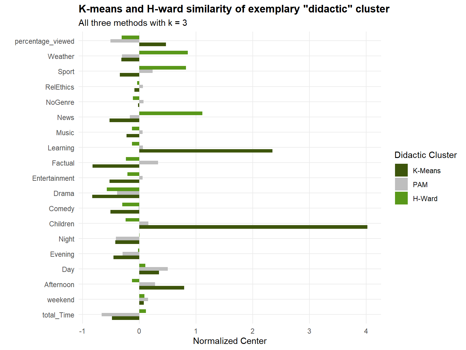
Conclusion: K means has already been discussed earlier. For pam we can see that cluster centers do not have such a clear tendency (also confirmed by PCA) but cluster sizes are more similar. As expected, due to skewed data H average did not yield any useful results with two clusters having only a handful of datapoints. H ward on the other side yielded similar results to k-means, both in cluster sizes and center positions.
Subsample check
At this stage you must have chosen the number of clusters. We will try to reinforce your conclusions and verify that they are not due to chance by dividing the data into two equal parts. Use K-means clustering, fixing the number of clusters to your choice, in these two data sets separately. If you get similar looking clusters, you can rest assured that you conclusions are robust. If not you might want to reconsider your decision.
# splitting data into two --------------------------------------
set.seed(1234)
train_test_split <- initial_split(userData_clust,
                                  prop = 0.5)
testing <- testing(train_test_split) #50% of the data is set aside for testing
training <- training(train_test_split) #50% of the data is set aside for training

# 1813 check same size
testing <- testing %>%
           filter(row.names(testing) != 781)

# fit k-means to each dataset
kmeans_training <- eclust(training,
                          "kmeans",
                          k = 3,
                          nstart = 50,
                          graph = FALSE)
kmeans_testing <- eclust(testing,
                         "kmeans",
                         k = 3,
                         nstart = 50,
                         graph = FALSE)

kmeans_training$size
## [1] 452 101 1259kmeans_testing$size## [1] 1100 635 77# PCA plot training --------------------------------------
pca_training <- fviz_cluster(kmeans_training,
training,
palette = "Set2",
geom = "point",
main = "K-means training (k=3)",
ggtheme = theme_minimal())+
scale_colour_manual(values = c("#8DA0CB", "#66C2A5", "#FC8D62")) +
scale_fill_manual(values = c("#8DA0CB", "#66C2A5", "#FC8D62"))+
scale_shape_manual(values = c(15, 16, 17))+
ylim(-6, 6)+
xlim(-3, 6)
# PCA plot testing --------------------------------------
pca_testing <- fviz_cluster(kmeans_testing,
testing,
palette = "Set2",
geom = "point",
main = "K-means testing (k=3)",
ggtheme = theme_minimal())+
scale_colour_manual(values = c("#FC8D62", "#8DA0CB", "#66C2A5")) +
scale_fill_manual(values = c("#FC8D62", "#8DA0CB", "#66C2A5"))+
scale_shape_manual(values=c(17, 15, 16))+
ylim(-6, 6)+
xlim(-3, 6)
# PCA plot all --------------------------------------------
pca3_plot <- fviz_cluster(model_kmeans_3clusters,
userData_clust,
palette = "Set2",
geom = "point",
main = "K-means all data (k=3)",
ggtheme = theme_minimal())+
scale_colour_manual(values = c("#FC8D62", "#66C2A5", "#8DA0CB")) +
scale_fill_manual(values = c("#FC8D62", "#66C2A5", "#8DA0CB"))+
scale_shape_manual(values=c(17, 16, 15))+
ylim(-6, 6)+
xlim(-3, 6)
pca3_plot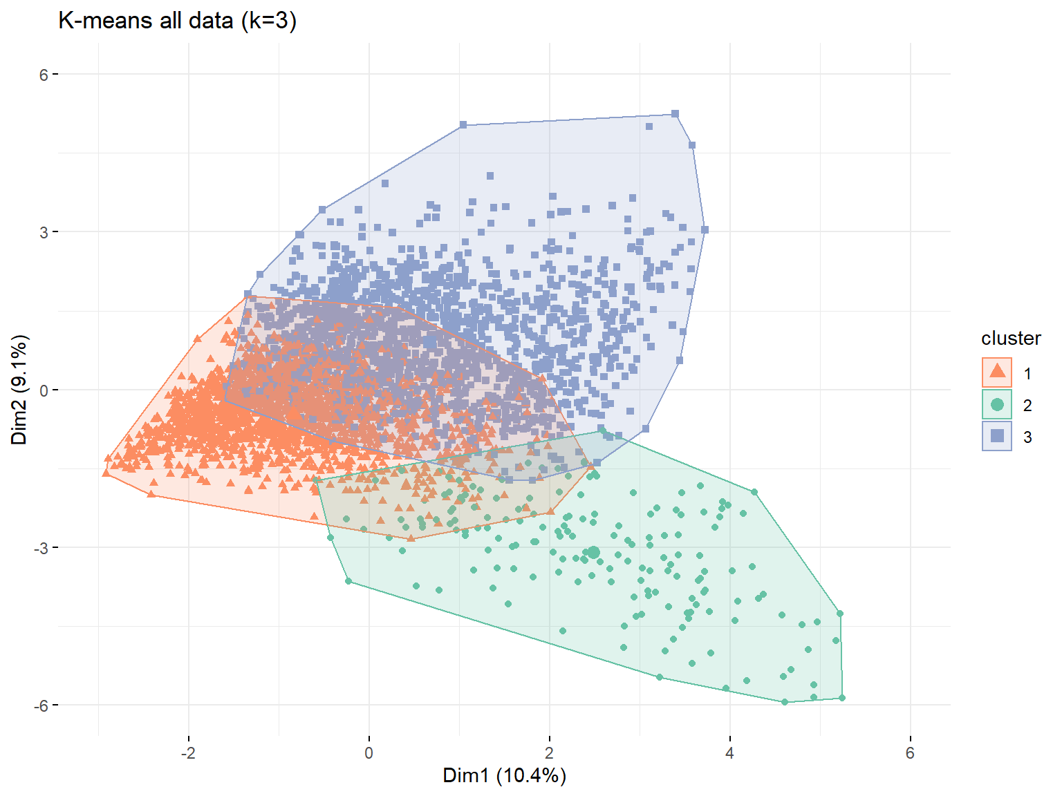
pca_training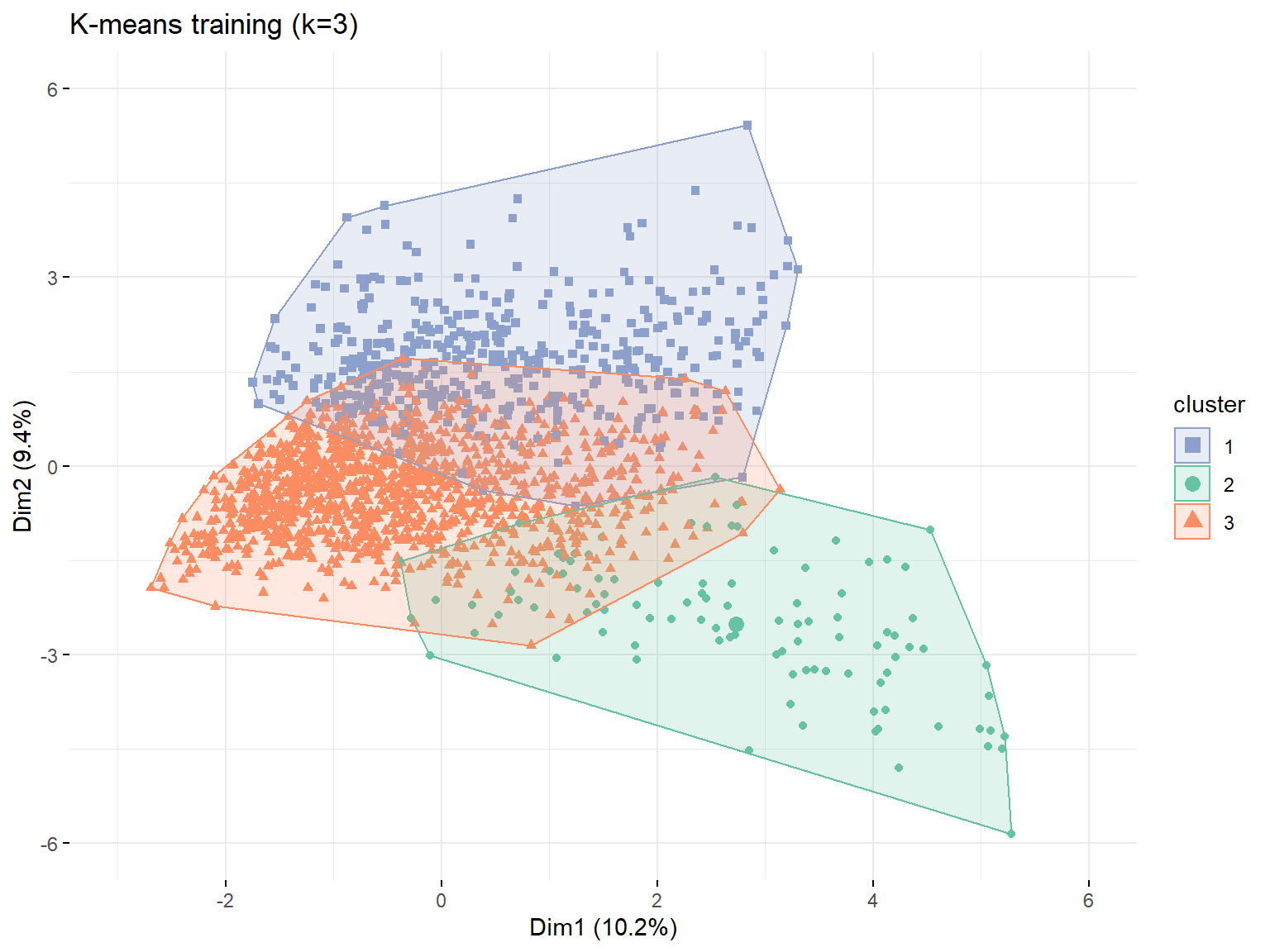
pca_testing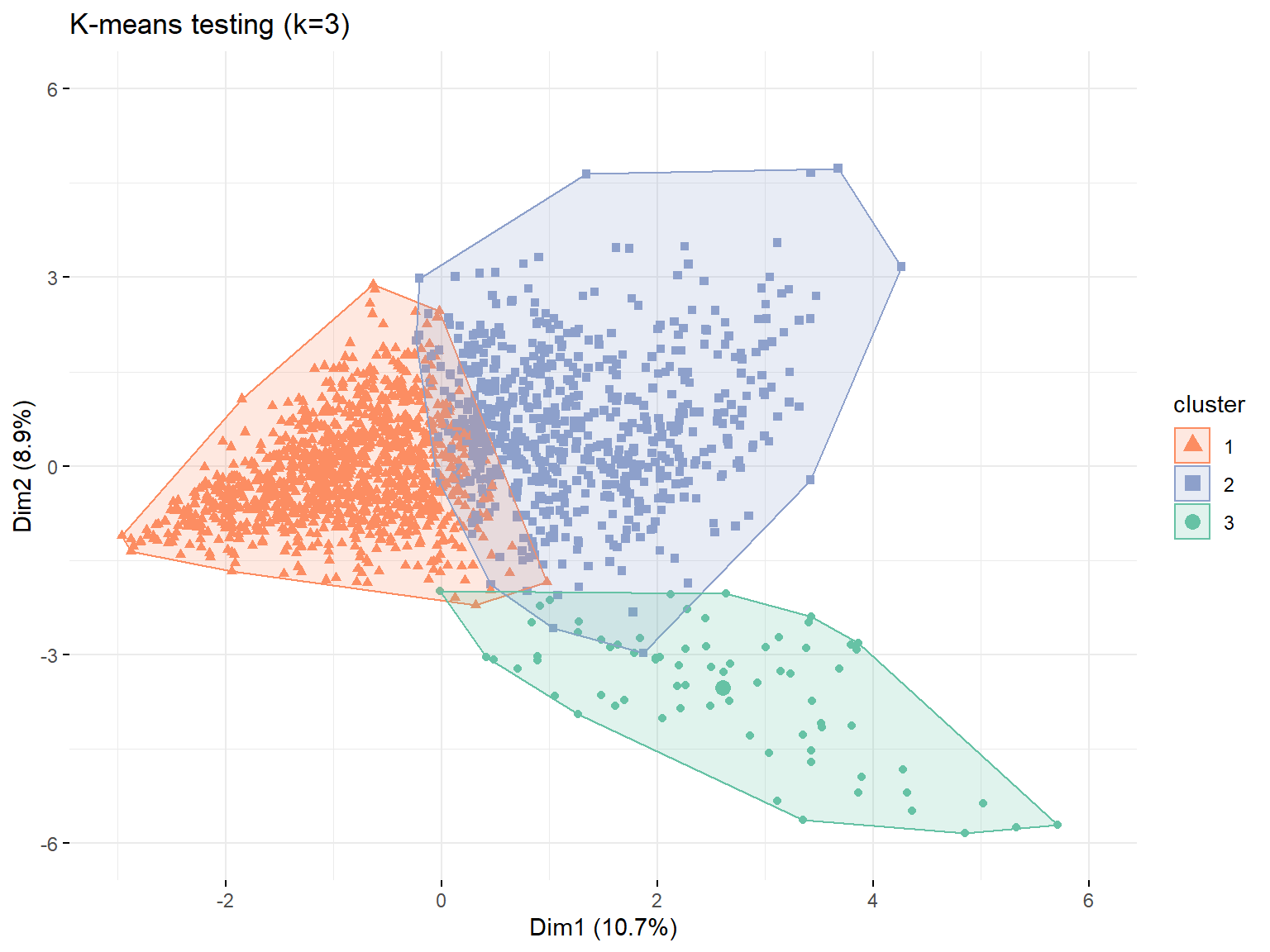
# center plot training --------------------------------------

# generating new data frame with cluster centers and cluster numbers
training_centers <- training %>%
                    mutate(cluster = as.factor(kmeans_training$cluster))

training_centers <- training_centers %>%
                    group_by(cluster) %>%
                    summarize_at(vars(total_Time:percentage_viewed),
                                 mean)

# gather to bring in long format
training_centers <- gather(training_centers,
                           key = "variable",
                           value = "value",
                           -cluster,
                           factor_key = TRUE)

# ggplot to visualize centers
pCenters_training <- training_centers %>%
                     ggplot(aes(x = variable,
                                y = value))+
                     geom_line(aes(color = cluster,
                                   group = cluster),
                               linetype = "dashed",
                               size = 1)+
                     geom_point(size=1,shape = 4)+
                     geom_hline(yintercept = 0)+
                     labs(title ="K-means training Centers k = 3",
                          fill = "Cluster")+
                     theme(text = element_text(size = 10),
                           axis.text.x = element_text(angle = 45,
                                                      hjust = 1),
                           legend.title = element_text(size = 5),
                           legend.text = element_text(size = 5))+
                     theme(legend.position = "bottom",
                           axis.title = element_blank())

# center plot testing --------------------------------------

# generating new data frame with cluster centers and cluster numbers
testing_centers <- testing %>%
                   mutate(cluster = as.factor(kmeans_testing$cluster))

testing_centers <- testing_centers %>%
                   group_by(cluster) %>%
                   summarize_at(vars(total_Time:percentage_viewed),
                                mean)

# gather to bring in long format
testing_centers <- gather(testing_centers,
                          key = "variable",
                          value = "value",
                          -cluster,
                          factor_key = TRUE)

# ggplot to visualize centers
pCenters_testing <- testing_centers %>%
                    ggplot(aes(x = variable,
                               y = value))+
                    geom_line(aes(color = cluster,
                                  group = cluster),
                              linetype = "dashed",
                              size = 1)+
                    geom_point(size = 1,
                               shape = 4)+
                    geom_hline(yintercept = 0)+
                    labs(title ="K-means testing Centers k = 3",
                         fill = "Cluster")+
                    theme(text = element_text(size = 10),
                          axis.text.x = element_text(angle = 45,
                                                     hjust = 1),
                          legend.title = element_text(size = 5),
                          legend.text = element_text(size = 5))+
                    theme(legend.position = "bottom",
                          axis.title = element_blank())

pCenters_training 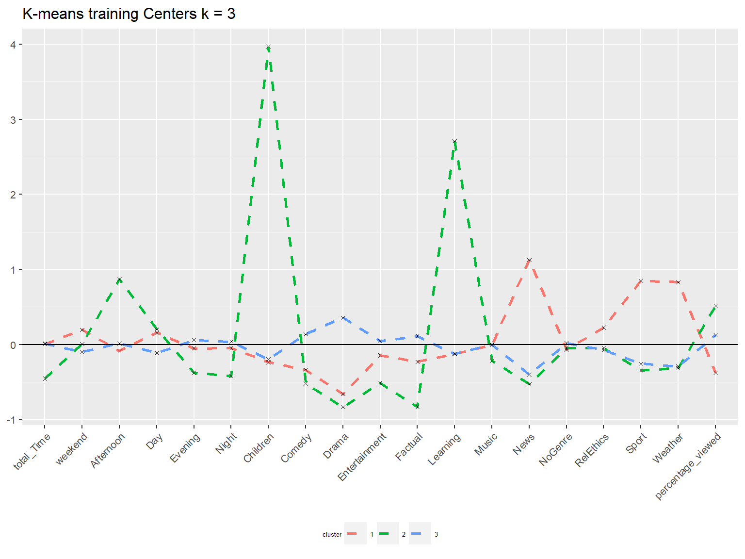
pCenters_testing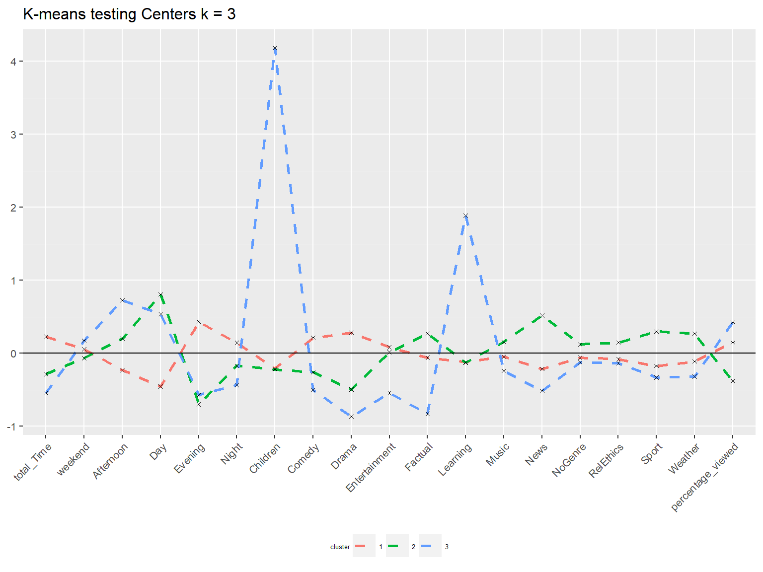
Although we could not see the exact same results, similar patterns between in sample and out of sample can be recognised. This is true for PCA and center analyses. We can thus conclude that the proposed clustering is not due to random chance.
Conclusions
Based on all the methods we could identify three clusters, Didactic, Informed, and Conoisseur that appeared repeatedly during different analyses.
We chose k = 3 since it that number appeared in two selection methodologies and yielded good interpretability. However, we have seen that different methodologies suggested different number of k.
Our results are based on the assumption that that the clusters are spherical and second that the clusters are of similar size. Robustness can be checked by sampling or even using completely new datasets. Confirmation bias, Texas sharpshooter fallacy, Bandwagon effect etc. are only some of the cognitivie issues that can affect clustering outcomes.
The BBC is not based on profit increase, using external ads should thus not be the main emphasis. It is instead suggested to increase the user experience by suggesting adeguate channels by genre to relevant customers, and adapt streaming times and durations.